Not sure if this is the right place for this on not, whether this sort of thing could be done in XSLT or would require javascript or even just CSS. I have an Umbraco V4 website and on the home page I want to display a horizontal list of products with images. I have seem some examples on other websites that show a number of items dependant on how wide the browser window is, an example of this if the following website http://www.eden.co.uk/ under the "New Releases & Must Have Presales" heading there are a number of images and if you increase the size of your browser window then you can see that more are visible. Another example is the tabs at the top of this website http://appliances.pricegrabber.co.uk/st=category. Does anyone know how this can be done. I have been searching through google but it's difficult to know what to search for and so far I haven't found anything that helps. Any help or suggestions would be greatly appreciated.
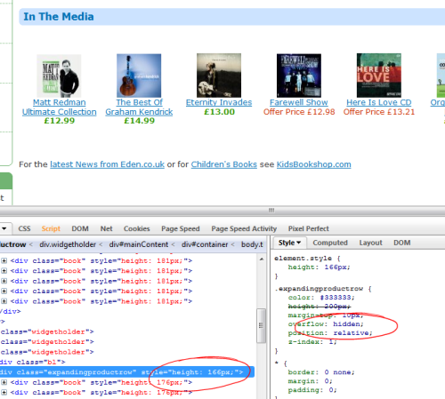
It's not that hard. The container of these items has a overflow:hidden property. The items itself have a fixed width, so they appear only if there is space for these items. If the browser resizes, there might be place for the items to show up. The items float left and the container has a height definition. IF there is no space for the items, the items are rendered but not visible because the container is just as high as a single item.
Try firefox + firebug as a superb combination to see what is happening.
BTW, those ellastic layouts are not from this time any more. Stick to fixed layout for better brwosing experience and it saves you lots of time!
Folkert, I didn't realise it was going to be that simple, thanks very much. We usually always build fixed width websites but the customer has unfortunately requested that this website we are building expands with the browser so I am having to spend the time making it work. Once again thanks for your help, I was almost convinced that there must be some sort of fancy javascript behind it!
Number of items based on browser width
Hi All,
Not sure if this is the right place for this on not, whether this sort of thing could be done in XSLT or would require javascript or even just CSS. I have an Umbraco V4 website and on the home page I want to display a horizontal list of products with images. I have seem some examples on other websites that show a number of items dependant on how wide the browser window is, an example of this if the following website http://www.eden.co.uk/ under the "New Releases & Must Have Presales" heading there are a number of images and if you increase the size of your browser window then you can see that more are visible. Another example is the tabs at the top of this website http://appliances.pricegrabber.co.uk/st=category. Does anyone know how this can be done. I have been searching through google but it's difficult to know what to search for and so far I haven't found anything that helps. Any help or suggestions would be greatly appreciated.
http://www.alistapart.com/articles/responsive-web-design/ is well worth a look here, but not exactly what you're after perhaps. Also worth a look at is http://particletree.com/features/dynamic-resolution-dependent-layouts/, although it's a bit older and geared more towards desktop devices.
It's not that hard. The container of these items has a overflow:hidden property. The items itself have a fixed width, so they appear only if there is space for these items. If the browser resizes, there might be place for the items to show up. The items float left and the container has a height definition. IF there is no space for the items, the items are rendered but not visible because the container is just as high as a single item.
Try firefox + firebug as a superb combination to see what is happening.
BTW, those ellastic layouts are not from this time any more. Stick to fixed layout for better brwosing experience and it saves you lots of time!
Thanks for the responses.
Folkert, I didn't realise it was going to be that simple, thanks very much. We usually always build fixed width websites but the customer has unfortunately requested that this website we are building expands with the browser so I am having to spend the time making it work. Once again thanks for your help, I was almost convinced that there must be some sort of fancy javascript behind it!
is working on a reply...
This forum is in read-only mode while we transition to the new forum.
You can continue this topic on the new forum by tapping the "Continue discussion" link below.