Umbraco razor dynamic divs with a large div and smaller ones around it
Hi all,
I'm trying to create a dynamic template that automatically adds divs when more items are added to the page.
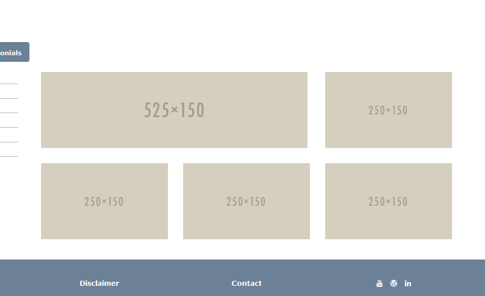
I would like to create a col-lg-8 on the left and the around it and below it col-lg-4's.
The first div (col-lg-8) needs to show the latest item, then others needs to descend to the first item ever created. So it's with a sorting on the page id. That's not that hard to do.
But how can I code it in such a way that the first item is shown in the col-lg-8 and the others in the col-lg-4's?
Thanks in advance!
As an example see the static version with holders.
What you could do is to check in a foreach loop where you iterate and render your divs, if the element you're about to render is the first item in that list. See example:
@{
    List<IPublishedContent> elements = Model.Children.ToList(); // This would in your case be replaced for your list of elements.
}

@foreach (var element in elements)
{
    var className = elements.IndexOf(element) == 0 ? "col-lg-8" : "col-lg-4";

    <div class="@className">
        @element.Name
    </div>
}
If I would use CSS and I wish to change it then I have to dig in my css each time. With code I would only need to open the partial view that runs that part of the code.
Hi Dennis,
Perfect. Found my own way of doing it as well this morning.
Yours I can use for a different part of the site :)
Related to this I have a second page which needs to list news articles.
The articles would have the same size with the only exception for articles that do not have a picture of the newspaper/ article.
It creates the div, but it places spaces between the rows.
How can I tweak it in such a way that they tend to "stick" together?
Like in a newspaper page where you have a big article then two smaller ones and then a medium sized one, etc... all neatly placed together.
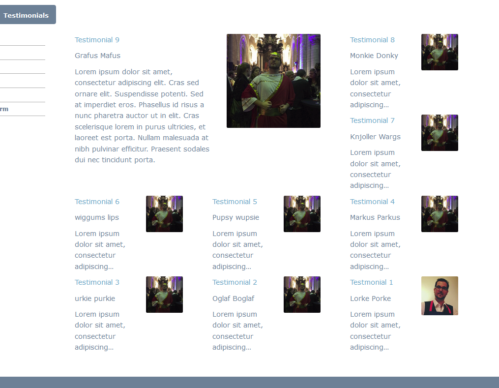
i.e. You see in the current example that article 1 and 4, 3 and 6 neatly placed together. But there is a gap between 2 and 5.
Umbraco razor dynamic divs with a large div and smaller ones around it
Hi all,
I'm trying to create a dynamic template that automatically adds divs when more items are added to the page.
I would like to create a col-lg-8 on the left and the around it and below it col-lg-4's.
The first div (col-lg-8) needs to show the latest item, then others needs to descend to the first item ever created. So it's with a sorting on the page id. That's not that hard to do.
But how can I code it in such a way that the first item is shown in the col-lg-8 and the others in the col-lg-4's?
Thanks in advance!
As an example see the static version with holders.
Why not just with css?
Hi Laurens.
What you could do is to check in a foreach loop where you iterate and render your divs, if the element you're about to render is the first item in that list. See example:
Best of luck!
Hi Soren,
If I would use CSS and I wish to change it then I have to dig in my css each time. With code I would only need to open the partial view that runs that part of the code.
Hi Dennis,
Perfect. Found my own way of doing it as well this morning. Yours I can use for a different part of the site :)
My version works as follows:
And the result of it is this: (Ignore the pictures, just testing images)
Related to this I have a second page which needs to list news articles. The articles would have the same size with the only exception for articles that do not have a picture of the newspaper/ article.
It creates the div, but it places spaces between the rows. How can I tweak it in such a way that they tend to "stick" together?
Like in a newspaper page where you have a big article then two smaller ones and then a medium sized one, etc... all neatly placed together.
i.e. You see in the current example that article 1 and 4, 3 and 6 neatly placed together. But there is a gap between 2 and 5.
You can use flexbox for getting equal heights, check out this great video course: http://flexbox.io/
Thx, looking through the videos and sources now.
But how could I create it like this? As it's not really explained.
So you see the different "articles" knitted together on the screenshot below.
is working on a reply...
This forum is in read-only mode while we transition to the new forum.
You can continue this topic on the new forum by tapping the "Continue discussion" link below.