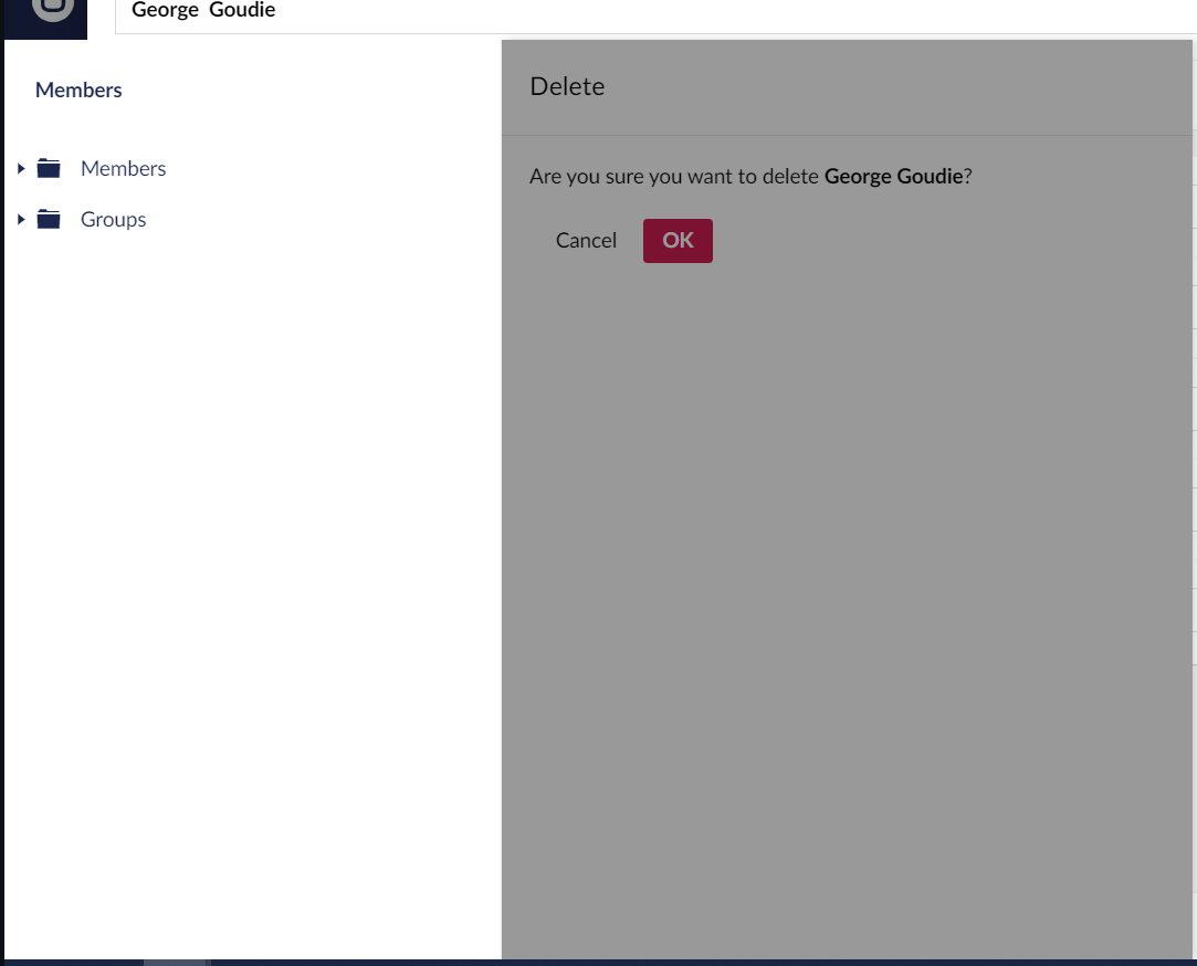
I'm running latest version 9.3.1 but noticed this with 9.2 as well, I think the member options were moved around at some point and now the deleting member confirmation is under the background and the layout is a little strange:
Do you perhaps have some extra extension for the backoffice layout or custom CSS? As I can't see/understand how your layout is shown.
When I try to delete one (on 9.3.1), It's neatly shown on top of everything (notice the bar at the top that has the name? It appears way behind the screens as it should)
I've just figured it out, I'm using the MemberListView plugin so my client can see the roles for each user. When selecting a member through that view and not the default view that's when the weird layout issues occurs
Delete member popup under background
I'm running latest version 9.3.1 but noticed this with 9.2 as well, I think the member options were moved around at some point and now the deleting member confirmation is under the background and the layout is a little strange:
Do you perhaps have some extra extension for the backoffice layout or custom CSS? As I can't see/understand how your layout is shown.
When I try to delete one (on 9.3.1), It's neatly shown on top of everything (notice the bar at the top that has the name? It appears way behind the screens as it should)
I've just figured it out, I'm using the MemberListView plugin so my client can see the roles for each user. When selecting a member through that view and not the default view that's when the weird layout issues occurs
is working on a reply...
This forum is in read-only mode while we transition to the new forum.
You can continue this topic on the new forum by tapping the "Continue discussion" link below.