Diplo Date Range Picker
Overview
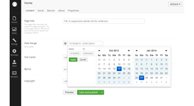
This is an Umbraco 7 data type (property editor) that allows you to add a date range picker to a document type in Umbraco. It is based on the Date Ranger Picker for Bootstrap by Dan Grossman.
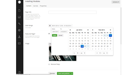
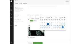
The UI allows you to select a range between two dates. It enforces that the end date must be the same or greater than the start date. There is also an optional mode that includes a time picker, too.
Note: This only works with Umbraco 7 or higher. Do not attempt to install on earlier versions. Version 1.2 has been tested against Umbraco 7.20. It should work on earlier versions, but if not try Version 1.1 instead.
Installation
You can install the package via the Developer > Packages section of Umbraco 7 – full instructions are here. Once installed you will then need to go to the Developer tree into the Data Types section where you can create a new Data Type and select ‘Date Range Picker’. You can then add a new property to a document type and select Date Range Picker as the property editor.
Imporant: You may need to force reload the back-end pages once added to ensure the control works. See Date Range Picker Appears Read Only? in forum (link at bottom of page).
Configuration
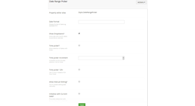
When you create a new Date Range Picker data type you will have a number of options you can set. These are:
Date Format
You can enter an optional date (and time) format string that will be used to format the dates when they are displayed in the property editor. This can be useful if you wish to localise or customise the display format. Note: This doesn’t change how the dates are stored.
The formatting is based on the date formatting strings provided by Moment.js library – please see http://momentjs.com/docs/#/displaying/format/ for the complete list.
The default format if left empty is YYYY-MM-DD
If you enable the Time Picker then it is a good idea to also add time formatting, too.
Show Dropdowns
If ticked this option will add year and month dropdowns above the calendar to allow jumping to a specific month and year.
Time Picker
If ticked this adds a time picker to the bottom of the calendar allowing times as well as dates to be selected.
Time Picker Increment
Increment of the minutes selection list for times when the Time Picker is enabled (i.e. setting to 15 will allow selection of 0, 15, 30 and 45 minutes past the hour).
Time Picker 12 Hour
If enabled this will display times using AM and PM rather than in 24 hour format.
Allow Manual Editing
By default the date picker does not allow any typing within the date box. This ensures only valid date ranges can be entered. However, you can disable this and allow editors to manually enter and manipulate dates.
Initialise With Current Date?
By default the date picker will be empty, potentially allowing no date to be selected (if you do not make the property mandatory). However, ticking this option will always initialise the date picker with the current date (when no date has been previously selected), ensuring a date range must always be selected.
Accessing the Dates In Umbraco
This package includes a Property Converter that will automatically de-serialise the date range into a .NET object (Diplo.DateRangePicker.DateRange) when you try and access the content via a Razor script.
The DateRange class has two properties which are StartDate and EndDate.
Accessing via Razor using IPublishedContent
@{
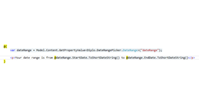
var dateRange = Model.Content.GetPropertyValue<Diplo.DateRangePicker.DateRange>("dateRange");
<p>Your date range is from @dateRange.StartDate.ToShortDateString() to @dateRange.EndDate.ToShortDateString()</p>
}
You can also access the date range as a dynamic object via the following syntax (assuming you have a property alias called ‘dateRange’ on your page):
@CurrentPage.DateRange.StartDate @CurrentPage.DateRange.EndDate
You can also just output the entire date range as a string using:
@Umbraco.Field("dateRange")
This will output something like 10/17/2013 - 1/27/2014
and is dependent on the current culture settings of the page.
Note: If no date range has been selected then the variable dateRange in the above examples would be returned as NULL.
- Package Files
- Documentation
- Archived Files
