Widget Grid
Description
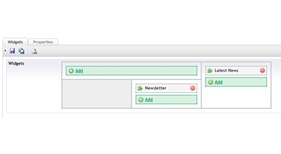
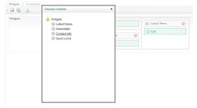
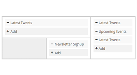
Widget Grid is a content picker which allows you to assign selected content to areas within a grid. Predominantly meant for widget based layouts, it lets you define a wireframe grid structure to store content links in, and then access those links in code based upon the cell id. By using a grid structure it allows the editor to more easily understand how they relate to an overall page structure.
How To Use
To use, simply create a new Data Type selecting Widget Grid from the list of available render controls.
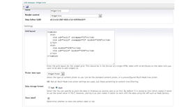
Config options are then as follows:
- Grid Layout
This should be a single html table wireframe representation of the structure of your page (NB this is only used to give the editor a visual queue, rather than affecting your design in anyway. This table won't be used on the front end in any way). You should use colspans and rowspans to create merged cells. For any cell which you want to be able to assigned widgets to, simply ad an id attribute to the cell. The id value will also be the key you'll use the access the values via code. You can add other table attributes such as widths to make your table more closely represent you pages design. To limit the maximum number of widgets allowed in a cell, you can also set the data-max attribute to any numberic value, ie data-max="2" limits a cell to a maximum of 2 widgets. - Picker Data Type
This should be the picker data type to use for selecting content with. By default it will use the standard content picker, but if you want to have more control over what is selected, you can also point it to a configured multi node tree picker and it will use the filter settings defined on it to limit the start node / selectable node types. - Data Storage Format
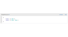
This allows you to set how you want to store the value for the data type. The default is XML and is suitable for access using XSLT. However if you intend to access the property via code, you might prefer to have it store its value as JSON so that you can more easily parse the value. - Show Label
This allows you to decide whether to display the label next to the widget grid or not.
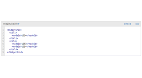
When configured, add the datatype as a property on your doctype and you are good to go. See the screenshots below for details on the data format structures when accessing the Widget Grids value.
Browser Support
Widget Grid has been tested in the following browsers:
- IE8+
- FF (Latest)
- Chrome (Latest)
Change Log
1.0
- Initial Release
- Fixed issue with having multiple widget grids on one doc type not working
- Added support for data-max
- Fixed error in table example on prevalue editor
- Umbraco 7.1.x support
- Package Files
- Documentation
- Archived Files

