QuickBlocks
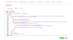
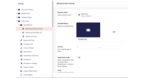
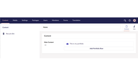
A package for quickly building block list based Umbraco websites all from data attributes in your HTMl
Installation
At the moment, it is best to use this on a brand new empty umbraco site. You can create your empty site and install QuickBlocks using these commands. You should be able to paste it all into the command line.
# Ensure we have the latest Umbraco templates
dotnet new -i Umbraco.Templates

# Create solution/project
dotnet new sln --name "MySolution"
dotnet new umbraco --force -n "MyProject" --friendly-name "Administrator" --email "admin@example.com" --password "1234567890" --development-database-type SQLite
dotnet sln add "MyProject"

#Add QuickBlocks
dotnet add "MyProject" package Umbraco.Community.QuickBlocks --prerelease

dotnet run --project "MyProject"
#Running
Watch this video to see how I use it.
Data Attributes
Here are some examples
Home Page and Block List Property
<div data-content-type-name="Home Page"
     data-prop-name="Main Content"
     data-prop-type="[BlockList] Main Content"
     data-list-name="Main Content">
  ...
</div>
Add a row
<section data-row-name="Simple Link">
...
</section>
Add a property to the row
<a href="#" data-prop-name="Link">My Link</a>

<img src="#" data-prop-name="Image" />

<h2 data-prop-name="Image">Hello</h2>

<p data-prop-name="Description">
     My content in here
</p>
Preview View and CSS
If you are using the package Umbraco.Community.BlockPreview you can add this to the block list to set the preview path and css on all blocks. This can be set on an individual row too.
<div data-content-type-name="Home Page"
     data-prop-name="Main Content"
     data-prop-type="[BlockList] Main Content"
     data-list-name="Main Content"

     data-use-community-preview="true"
     data-preview-css="~/css/styles.css">
  ...
</div>
Or if you'd prefer to use your own preview file you can specify it like this
<div data-content-type-name="Home Page"
     data-prop-name="Main Content"
     data-prop-type="[BlockList] Main Content"
     data-list-name="Main Content"

     data-preview-view="~/assets/html/mypreview.html"
     data-preview-css="~/css/styles.css">
  ...
</div>
Specify a different data type
<h2 data-prop-name="Title" data-prop-type="Richtext editor">Use an image as a background image
<header style="background-image: url('[!image!]')" data-row-name="Header" data-prop-name="Image" data-replace-marker="[!image!]" data-replace-inner="false" data-prop-type="Image Media Picker">
     ...
</header>
Use a Multi URL Picker for repeating links and use the name for the icon
<a href="#" data-prop-name="Social Links"
     data-prop-type="Multi URL Picker"
     data-multiple="true"
     data-replace-attribute="class"
     data-replace-inner="true"
     data-replace-marker="[!name!]"
     data-prop-value=".Name">
          <i class="fa fa-[!name!]"></i>
</a>
Create a list property inside a row
In the sub list items, we don't need to specify the property location, we only do that for row or page properties.
<div data-row-name="Services">
     <h2 class="title" data-prop-name="Title">We build awesome products</h2>
     <h5 class="description" data-prop-name="Description">This is the paragraph where you can write more details </h5>
     <div data-sub-list-name="Service List"
          data-prop-name="Services"
          data-prop-type="[BlockList] Service List"
          data-list-inline="false">

          <div data-item-name="Service Item">
               <h4 class="info-title" data-prop-name="Title">1. Design</h4>
               <p data-prop-name="Description">blah blah blah</p>
               <a data-prop-name="Link" href="#pablo">Find more...</a>
          </div>
     </div>
</div>
Move some HTML to a partial view
<footer data-partial-name="Footer">
     ...
</footer>
Extra block list options
Max Width
data-list-maxwidth="100%"Single block mode
data-list-single="true"Live editing mode
data-list-live="true"Inline Editing
data-list-inline="true"List Min Items
data-list-min="0"List Max Items
data-list-max="3"Extra row options
Block Row Icon
data-icon-class="icon-science"Block Row Icon Colour
data-icon-colour="color-indigo"Block Row Label Property
data-label-property="title"Contributing
Contributions to this package are most welcome! Please read the Contributing Guidelines.
Acknowledgments
Thanks to my employers ClerksWell for allowing me some time during my work day to work on this project on top of my own spare time.
