I found a problem with the background image at the top of "Blog Post List Page", "Content Page" and maybe other places.
If you have a screen with a screen resolution higher than 1920, the image will start over, and not adapt to the screen. At the hero image at the frontpage, the image does adapt to the screen.
This is a known issue. It was not designed to go over 1920px from the start. I can't test right now, but what if you proportionally changed both width and height in the GetCropUrl call, e.g. 3840 x 1200? I know it's not a very elegant workaround.
The only thing I can promise you is that the new upcoming version of the Umazel Starter Kit will feature dynamically generated responsive images with different original dimensions depending on viewport size, both for normal and background images. This will be an implementation based on the principles of these blog posts:
Yeah changing the size is not an elegant workaround, i tried that yesterday.
My fix is that i changed the style of the background, and added background-repeat:no-repeat; background-size: 100%;, in this way the center of the bagground image will stay in the center of the screen, and it will always stretch out the image to match the screen. I personally think that its a better way to handle the problem that way.
Background Image on sceens bigger than 1920
Hi
I found a problem with the background image at the top of "Blog Post List Page", "Content Page" and maybe other places.
If you have a screen with a screen resolution higher than 1920, the image will start over, and not adapt to the screen. At the hero image at the frontpage, the image does adapt to the screen.
The background image use this setting:
and the hero image use this:
I've tried to use the same settings for the background image as the hero image uses, but it's not fixing the problem.
Is it possible to fix this somehow?
I can also see that it's the same problem on your own website: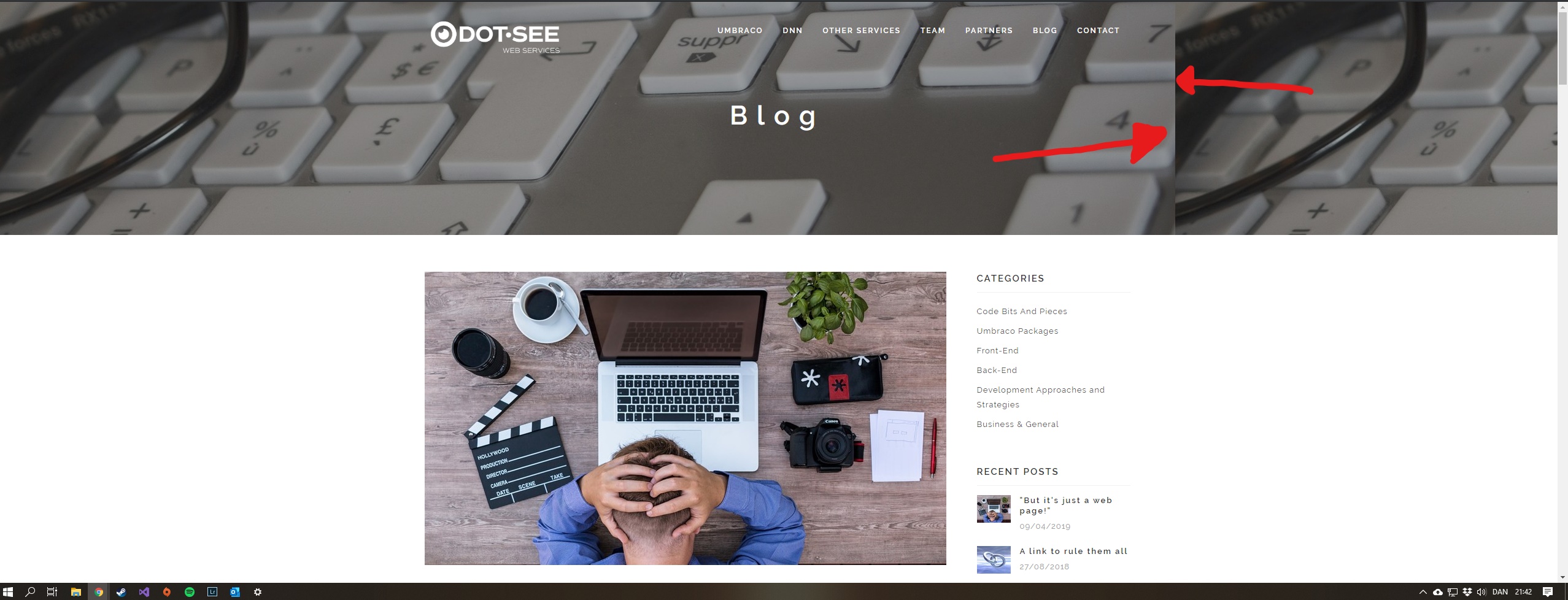
This is a known issue. It was not designed to go over 1920px from the start. I can't test right now, but what if you proportionally changed both width and height in the GetCropUrl call, e.g. 3840 x 1200? I know it's not a very elegant workaround.
The only thing I can promise you is that the new upcoming version of the Umazel Starter Kit will feature dynamically generated responsive images with different original dimensions depending on viewport size, both for normal and background images. This will be an implementation based on the principles of these blog posts:
https://www.dot-see.com/en/blog/responsive-background-images-in-umbraco-with-focal-point-preservation/ and https://www.dot-see.com/en/blog/responsive-images-with-srcset-and-image-cropper/
Yeah changing the size is not an elegant workaround, i tried that yesterday.
My fix is that i changed the style of the background, and added background-repeat:no-repeat; background-size: 100%;, in this way the center of the bagground image will stay in the center of the screen, and it will always stretch out the image to match the screen. I personally think that its a better way to handle the problem that way.
Old code and background:
I'm looking forward to see the upcoming version :)
is working on a reply...
This forum is in read-only mode while we transition to the new forum.
You can continue this topic on the new forum by tapping the "Continue discussion" link below.