I've played around with the current alpha of Umbraco V8 and I must say that it looks really good, love the progress!
One thing that me an my co-workers have been trying to "settle" with is the new way of presenting "Tabs" in the Content-section. Here's a node with two tabs "Grid Content" and "Content":
The "Tabs" are now stacked in one long page, I've heard that one of the reasons for this is an upcoming "side by side"-editing feature to be able to edit two variants side by side. That makes sense.
But I'm still not 100% sold on this UI design so I would just like to open a discussion around this. Would someone argue that a doc type has to many properties if it has 4-5 tabs? How do you guys work with tabs? Are we the only ones that would miss the them?
I'm also thinking that the layout could be configurable? Maybe with some switch on the document type? (Render with Tabs: True/False)?
thanks for raising this point and I also have some serious doubts how this will work on our websites. We sometimes just have some doc-types with a lot of tabs and properties, and I think it can become a mess/unclear quite fast.
But I didn't attempt to spin up v8 really serious and I don't know in which phase the design implementation is currently... So I don't want to bring in my thoughts too early on things that haven't been published yet.
I am also not completely sold on the accordion idea over tabs. My issue is that if on first load of a content node you only see the first open accordion you dont get a quick over view of all the tabs you are going to be working with, i.e SEO, Settings, Content etc.
With the accordion layout you wont see all of the sections you will be working with so dont get a quick overview or insight into everything that is involved in setting the content node up.
Good topic for discussing! I've not used v8 enough in anger or with clients to get a feel for what is going to work best, but I can see a few pros and cons already:
Accordion Pros
Doesn't suffer from tab overflow, especially on smaller screens (ie. when you have more tabs than screenspace and they wrap around)
Works better for "side by side" editing
Accordion Cons
Harder to see an overview of what sections a document type is composed of
Could result in more vertical scrolling to get to content
Couple of thoughts:
Maybe if all the Accordion panels where collapsed by default this would solve the "overview" problem (but at the expense of more clicks required to start editing).
Maybe we could have links that mimicked the tabs at the top, but anchors down to the Accordion item (which would open it)?
The interesting thing to consider here is the role of Content Apps...
And the different journeys that editors take when they interact with content
eg Creating Content vs Editing Content vs Comparing Content etc etc
If a standard content page might have on average 5 tabs? (yeah I've seen more...)
Then think how many of those properties on those tabs, are regularly updated for the content item, and how many of them are there for 'niche' functionalities...
So I pretty much always have a 'Page Settings' tab. that contains all the usual umbracoUrlName, umbracoInternalRedirect etc properties, at least 95% of the time these are ignored for a content item, but they are there, because every now and then its really useful on a node to be able to redirect or rename the slug, I provide them to the editor without really thinking... but come V8 I'm thinking these kind of properties are more suitable to a content app... or at least that is my understanding of what content apps might provide...
The SEO tab.... again all those SEO settings are they part of the content?
When I think about the regularly updates properties, for me they are usually spread across two tabs 'Main Content' and 'Related Content' usually picked - and the order of the properties reflecting how they fit into the editors mental model of the page, is the key.
Recently I've taken a more atomic approach, to organise smaller clumps of properties, across doc types, with compositions, eg no property is ever set on a document type directly, only on a composition, it's made me think alot more about when and where properties are combined... I think it's meant a less cluttered editing experience, although I'm not sure exactly why.
so I'm interested to see if V8 and content apps, will enable us to move of the 'meta' properties into more obvious content app sections, leaving the content properties with a better flow for creation, and comparison...
... however for 'editing' existing content 'journeys', the tabs probably get you to your place of update more quickly, I don't like trying to find things on accordions (remembering the old document type editor) ... but interesting to see how they are presented on first load, (eg all closed up) or whether there would be 'jump links'
I suspect in some journeys, for some content, the accordion single page of properties will win over the tabs, and for other types of content and updates, the tabs will feel better...
I would also argue that the new menu based solution for sections demands expensive real estate. About 90% of our clients use laptops in their daily work. About none of them has their Taskbar on the left, as Shannon had on his CG18 presentation ;). That said, their 16:9 or 19:10 resolutions are wider, and freeing up height over width is crucial!
My knee jerk reaction would be to agree that accordions doesn't feel as user friendly as the tabs. That said, it would be good to get some HQ input if possible to know / understand the challenges that led to this decision.
Without knowing that, I don't think we can suggest viable alternatives as we just don't have all the information.
Perhaps some kind of accordion navigation could be added to let editors jump directly to the desired section for editing? I dunno, just thinking out loud here. My main concern would definitively be editors getting lost on a mile long page of properties.
Sitecore had accordion style editing last time I checked (maybe still has, it's been a while) and that quickly became a bit of a nightmare to navigate. And yes, I know it's not fair to compare the two. Just saying :)
I've got to admit, when I first saw that tabs had gone in v8, my gut reaction was people ain't gonna be happy about this! Like others are saying on here, let's wait & see what HQ say, to justify the rational.
After reading the first few replies on this thread, I took a look at some of our own recent Umbraco implementations, to see how we are currently using tabs ... and it turns out to be pretty much as Marc outlines above.
Of course, there are variations for specific page types, but overall, we've got a definite divide between "content" that is specific to a page/doctype ... and configuration/settings of that page/URL.
e.g. the actual thing and then things about the actual thing.
... and this is where I see Content Apps fitting in. Of course, we know very little about them at the moment... and can't wait to hear more!
I guess that some of our solutions might "over use" the tabs but we try to put all the content and settings that's related to a page on that content node. Ie generic "push/list"-texts, CRM-settings for leadforms, SEO-information, menu-overrides etc.
This is how one of our sites look, each tab have everything from 3 to 10 different properties.
A possible solution would be to combine the tab navigation from V7 with the accordion from v8, as Kenn Jacobsen proposed.
The accordion would still exist, but we would get an overview of the contents with the tabs on top and could scroll to each section easily by clicking a tab item.
The problem here is that it wouldn't play too nice with the Content/Info tabs...
Great points - high five for all the input. There's reasoning behind the madness - whether it's great and whether we hit a home run is too early to say.
First, a bit of background. Over the last couple of years we've seen two trends:
Managing websites is beyond just editing content. We've seen various hacks to accommodate this via either adding menu items to the Actions menu, creating property editors that don't edit content at all but acts as placeholders for other functionality, dashboards and custom sections. We wanted a solution that made managing beyond editing as friendly as editing content. That's why we're introducing "Content Apps" with v8.
Pages become more complex. Combined with how v7 allowed more flexible property editors, this has opened up a lot of new editing experiences that required fewer properties but more space and clearer navigation of what you're editing. That's why we've been working on "Infinite Editing" for v8 (which requires more horizontal screen real estate - we need further testing, but could potentially compensate for this by minimizing/collapsing the top navigation).
Both of these concepts means that we needed to completely re-think the overall grid system of the Umbraco back office (as in navigation, panels, headers, etc).
We've tried what Tobias Klika did in the screenshot above (high five for the great example, btw), but it steals too much screen real estate and it also becomes unclear what the priorities in the UX (tabs and "content apps" compete for focus).
In the end, we've concluded that tabs in the back office are slightly overrated. When implemented well, they definitely help giving an overview but they can also give a false promise when done less well (especially in larger projects and when compositions are overused).
When you've used v8 for a while, it's also surprisingly nice that you just scroll down the content tab and in the end, save or publish - no jumping back and forward between tabs that scream with validation errors.
The biggest UX issue right now with the tabs being removed is to ensure fast navigation between the field groups and an overview of the groups. We'll have a couple of ideas to test including local navigation when clicking a group header as well as navigation to the different groups when you click "Content" at the top.
Hope this brings more insight. Tabs definitely has its place and was a great navigation pattern when sites were more simple and it was all about editing content. And no doubt that for some cases this will be a step back. However, I'm strongly convinced that for the majority of sites now and even more going forward, this is a small tax for an otherwise huge step forward.
I could see parts of navigation go into a more dedicated area, though (and also be less of magic strings and a more consistent way to handle urls, navigation, etc). But too early to change too many things and we need to learn more about how what we've done so far works in the wild.
Sorry if this is a stupid question but are content apps designed purely for displaying information or can they be used as an area to manage specific types of content.
With SEO the example would be meta titles and descriptions. Could this live in a content app or is this regarded as content as well?
Thanks for sharing the progress around this Niels! It's always interesting to get insight in to why stuff are built in a certain way.
As far as I understand "Content Apps" might be used for something like an integrated Google Analytics-view for showing stats for just this page, a view that render some external SEO-audit or what ever. But it will not be a place to edit content right? The aim here being to not to be forced to implement a "Property Editors" just to render a "content aware" angular-view.
While I do agree with your points about error messages on multiple tabs and love the idea of "Infinite Editing" I still think that it's really important to find a way to navigate fast to a "Tab"/"Field Group". Ie if you have a Grid in the first Field Group and then some page-specific settings further down, you don't want the editor to scroll forever to come down to these settings.
If the solution is good old tabs or something else is really secondary. I also raised the idea of Tabs being a configuration-option on the Content Type - that would give us as implementors of the website the option to choose what fits best in different scenarios.
I guess I'm just scared =D I've seen some Wordpress implementations with lots of different controls and inputs in a long accordion and for me the Tabs in Umbraco is a lot better, more structured approach and provide a way to focus on "parts" of the content that I'm editing.
Correct, that "Content Apps" (name still working title) is not for editing content.
The most important thing in UX is consistency, thus a toggle for whether to show tabs or not something to strive for - it would be a symptom that what we have doesn't work.
I have started to look at V8 this evening and this is also the one area that has surprised me the most about the chance of UI.
The built in support for multi-lingual sites in v8 looks great, definitely #hi5yr for building this into the core.
Over the last 20 years I have built a LOT of website, however the number of multi-lingual sites is probably around 10, as it happens, I am currently building a bilingual site for a client.
The site I am currently building has a complex design for its homepage, it can logically be broken down into 8 sections ( this excludes the navigation & footer that are defined elsewhere )
The page also has 3 additional tabs for:
SEO - Meta data / Schema.org config ( possibly )
Social Media ( Think Graph Data / Twitter Card Config etc )
Page Properties ( customising the Navigation Name, Page Name etc )
So in this current scenario, with logical groupings as far as the editor is concerned, we will end up with 11 tabs. It might seem a lot, however the page is reasonably complex and requires a lot of editable settings.
Before anyone suggests it, the site design is as far from a "grid" as you could get so using the Grid editor would not work for us.
My gut feeling is if the Accordion is now the way forward for Umbraco, there will need to be some way to allow editors to quickly see and navigate between the sections.
On pages like the one I just described, I think it's not going to be a great UX with a lot of vertical scrolling to find the content you need to edit, but for smaller pages I can see it could work well.
Like a couple of others have mentioned, it would be good to somehow separate the "page content" from the "page configuration", even if that was just some kind of visual difference in the accordion.
On the majority of sites, I would guess most pages will have properties that once set are never changed, so maybe being able to set the accordion default for each section ( i.e. open or close ) could work quite nicely?
Definitely something to discuss more and to test with some real world complex configurations.
Just some thoughts, I look forward to seeing how this pans out.
Great feedback, Chris. This is exactly the type of information we need.
Any chance you could e-mail me more information about how the homepage is setup so we can use this in our work (and get a better understanding of more "real world" projects)?
I would second that.
We need to figure out a way of hiding editable settings from editable content. On our sites we usually build recursive properties, a page gets its property values from the closest set value in the structure. Especially awesome when working with huge themed structural sites - I would say that's Umbracos big USP compared to other CMS'es. That said, we do need to put page specific settings somewhere. Not necessarily in tabs, but i would say not in an accordion.
This is really interesting and much more interesting than a focus on tabs vs accordions (which quickly ends up in a cheese is being moved / bikeshed discussion).
Ie. why (thus leading to what) is there a need to categorize and could Umbraco help with that, thus also adding more guidance and consistency ootb.
I know content apps are for 3rd party integration. But for me personally it would be a perfect fit to have content properties that control page settings in there. You could have for example a "Theming" content app that let's you manage all related properties to theming. I see info "tab" is also moved there.
Hmmm...seems the Last reply from me and Niels are gone...so posting again.
I know Content Apps are for 3rd party data integration. But for me it would be the best place to manage doctype properties for page specific settings. Eg...you could have "Theming" content app that let's you control all doctype properties related to that...I can thinkg of many scenario's that would fit in there.
This is exactly the information/feedback we need, ie. a conversation about what people are using tabs for and why there could be a stronger need to group information (instead of tabs vs accordion which ends up in a moving cheese/bikeshed discussion).
Right now we have Content and Info. It could make sense to look into if other default categories could be needed. This would also help with guidance and consistency.
Hmm...something strange is going on....2nd time I posted a reply and that it's gone after refreshing
Yep you are correct that it will be a "Tab" with a icon, placed where the content apps go.
So you can free up the accordeon for properties that change regularly.
We often end up with at least 7 or 8 tabs because we group properties by functionality. Like the screen shot below
But SEO and opengraph are almost never changed by editors. It would be nice not having them in the accordeon, so that area is only focussed on changing page content.
I do understand the importance of, and appreciate, consistency in the product. And I would argue that the removal of noise for the editor should be of primary concern.
What about the possibility to label a property as an editable content or a page specific setting? Each of em having their static position in the UI? The content properties would be of primary importance, but the page specific settings would still be in reach for the user?
Maybe I should have posted a different screenshot because this an overview with a customized list view.
But on "detail" pages the first tab would be the "Page Blocks" tab where they manage the grid content for this website. All others tabs are sorted by editing frequency.
So with this kind of separation in properties this would mean a lot of scrolling using the accordeon.
Maybe a toggable quick navigation for the accordeon would be nice as well. So you would only enable it on doctypes with a lot of "tabs".
Like I mentioned before I don't care if are tabs or accordeons..it's just moving the cheese. But what I do want is a good editor experience.
I will check will my client and get back to you, I am sure it will be fine. Ideally I will be able to just share access to the Umbraco Cloud dev site :)
In real life sites it is often necessary to have many tabs to logically divide content up. I get the impression the Core team think we should have less tabs, but this just results in a single tab containing unrelated content all thrown together. I think it's much better to have a single tab contain logically related content than have fewer tabs containing more content. This applies equally for accordions, if not more so.
The use of compositions actually makes it more likely you will have more tabs. In most cases it makes most sense to have a composition have it's own tab - this is partly because trying to merge tab content together (when two compositions have the same tab name and order) can result in random results. Plus it just seems neater to have one tab apply to one set of related content and not mix this up.
Also, sites evolve over time - you might initially start with a few tabs but then the client requests something new and it grows.
Also, as mentioned, a lot of sites will contain various "settings" that are required but less frequently accessed. This can be stuff like SEO settings, navigation settings (hide page, prevent deletion checkbox) and also, on the home page, site level settings. We tend to use the home page for any site level settings because this allows easy recursive access to them and also it works better when you have a multi-site set-up (ie. a multilingual site with four home pages).
I do fear that simple swapping tabs for an accordion is going to create a real usability problem for editors. Currently tabs are "sticky" so you always can quickly swap between them. This isn't the case in an accordion, where if you want to access the last tab you have to scroll down.
Late back to the game on this one, but just catching up on things.
I can't tell if we are saying tabs are inherently bad from a usability perspective? or, if we are simply loosing them to a) gain vertical real estate (seemingly because the sections nav has moved to the top to enable more horizontal space for infinite editing?) and b) because content apps now compete for focus?
It feels like it's mostly the later, which if that's the case, I do think the example from Tobias could be made to work better. How about we knock the tabs back so that they are clearly less significant than the content app?
From a vertical real estate perspective, the reality is we are talking 55 pixels difference from v7 so is this really a huge deal? I mean, it's not wasted space.
Also, when you consider the number of interactions accordions will create vs tabs ie, say you want to get to the meta data section, with accordions, this is either collapsing all accordions before this section, each being a click + mouse movement to the next collapse button in-between, or scrollwheeling multiple times to get there combined with the fatigue of attempting to identify the correct accordion as it scrolls past vs a positive single click action to get to a specific meta data tab.
Is this worth the compromise of 55 pixels? I think so. Especially when we are suggesting a lot of content will end up being edited in infinite editor windows anyway, in which case the vertical space is irrelevant because the modal opens over the top of all of this.
Ps, just to add to this, you already have the concept of knocked back (pseudo) "tabs" within the main editing area present in the doc type editor. Maybe this could be standardized as a pattern?
I think there needs to be some kind of quick way to get to the bottom accordions.
The grid is a perfect example of why accordions can be bad. I have a lot of pages, where the height of the grid editor (including content of course) is more than 5000 pixels.
Also the navigation between accordions is going to be a painful experience of random scrolling up and down.
The knocked back pseudo tabs showed by Matt could be one way of solving it, but also a dropdown nav from the Content tab (I'll see if I can make some mockups), or a floating flyout nav, or a minimap in the right side could work.
I think what will be essential is that this feature needs full end user testing with content editors. This would need to be with some real content that is representative of what a modern Umbraco site might contain.
A good way of doing this might be to convert an existing U7 site to U8 and then give a cross-section of editors time to use both and report back which they find easiest to use (alongside any other feedback).
We also need to consider that, initially at least, a lot of U8 editors will be people with U7 experience and the transition to U8 has to be as smooth as possible for them.
The primary goal of a user interface is simplicity. Always has been because it has to be for safety, in engineering terms. You should be able to sit an editor down in front of this thing and be able to follow their nose. The maxim "Don't make me think" still stands. So it's really important that the editor gets an easily accessible overview of the page estate and they can get to each bit with as little effort as possible. Try this thing out with a huge site, say editing 50 news items and see how your wrist is.
Just my 2 pen'th ;) (I haven't even opened V8 yet but common principles apply. KISS ;) ).
At the UK Umbraco Festival it was mentioned that there would be user testing around the tabs vs. accordion debate and that the accordion ui may not end up being the final look for the content editor after all.
I was just wondering now that V8 has a launch date (end of Q1 2019), has this user testing taken place? If so, what was the outcome of it? I would be very interested in learning more about what users outside of the community thought about the accordion editor view. Would be great to hear from HQ on these results :-)
If this testing has yet to take place then I think it would be a great idea to engage with various developers within the community to create a range of content editing scenarios (from the basic to more complex) that they have created in real-world client projects. Then presenting the test users with the tabbed V7 version versus the accordion V8 version. Rather than testing against perhaps a simple text field in one accordion, a rich text editor in the next, an image in another etc (I only mention those as from the videos shared from HQ this tends to be what is presented). This way you will be able to gauge the true affect of tabs vs. accordions.
In addition, it is mentioned above that "Content Apps" is still a working title - I do personally think it is confusing having Apps and Content Apps. The average content editor probably wouldn't understand the difference and this could cause confusion when engaging with their developers. Therefore, my question on that for HQ would be, has there been any further thought around a final name for "Content Apps"?
I'd just like to bring this list of recent UI/UX disasters to people's attention so that we don't make similar assumptions that caused these to happen:-
Ubuntu - Unity interface
Windows 8 - Metro interface
Almost any new Google interface
Microsoft Office - Ribbon
Microsoft Azure - Portal interface
In an ideal world UI/UX experts wouldn't just be graphic designers but also have some MMI / psychology training ;)
Have had a quick look at the new interface and played around with the DocType editor etc.
Accordions are not the way IMHO. There's too much mouse movement required compared to tabs and scrolling makes no sense (most aren't editing on a touch screen). Would be far worse on a track pad.
If accordions are final then they need to be all closed on page load (or optionally set the top one open).
New tabs could be displayed like they are in the new Settings section, i.e. minimally with a green underline and allowed to wrap if there are too many for a small screen width.
In the Settings section, I'd have DocTypes, DataTypes then Macros. In 9 years I don't think I've ever changed a Media Type but maybe that's just me. But I'm always in the DateTypes and often in Macros.
I'm editing on a 32" 4K screen and there's acres and acres of empty space. Had a go with with infinite editing and while I like the concept there's still masses of empty space so not too sure why the insistance on the menu going to the top. It's actually handier were it was in V7 as well as in the eye-line. I appreciate I may not be typical in the hardware dept.
Are we redesigning the interface for mobile first because that doesn't make sense to me unless someone can show clients/users are definitely heading in that direction in a major way.
Is there anywhere where comments are collated centrally?
Do accordions in v8 provide a more friendly content editing experience than the tab solution in v7?
I'm worried about the content editors experience. Has Umbraco HQ done any user testing and research about this change? Maybe the results showed content editors liked accordions?
At first glance - I don't like them.
I think it's important to craft and provide a focused editing experience. Content editors are asked to do a lot. Sometimes they are managing a simple landing page with only a few basic properties (I've included a screenshot of 1 such example below) and other times they can be managing a product in an e-commerce catalog, it's variants, marketing messages for social networks AND the resulting web page.
If by any chance this was designed without any consideration or input from the users effected by the change, I'd recommend (1) producing interactive prototypes, (2) working with partners or clients HQ has a direct relationship with to conduct user tests. The data will either validate your decision or lead you to producing a better product. It's much easier to fail fast and iterate in a design program like Adobe XD then it is to prototype everything out by code.
Can I share a few screenshots with you?
I apologize I can't give this my full attention, but I wanted to show our simplest web page, how it would translate to v8, and two (2) recommendations off the top of my head.
Thanks for sharing your slides! Number 3 is a great idea and it echos the layout of the "Info" section already present in the Content Apps part of the node in V8. So it's just expanding on the UI that is already present in the CMS.
It's a must for a content editor to get an instant overview of the content that will need to be edited within a node.
Great set of options, thanks for putting this together as a discussion piece. I added my comments to the demo but as everyone else seems to have put them here, here's mine :-
"Slide 4 would get my vote. A "User" interface has to give great weight to human factors. Eye-tracking, wrist/hand movements and all other usability factors. It's not good enough to sacrifice this to shoe-horn in a developer's clever idea. It has to stack up on all counts. Love the idea of infinite editing but if that's at the cost of the simple overview of content areas (i.e. tabs) then I'd rather not have it. I can hear editors' comments now. They'd have more difficulty finding stuff that should be in front of their face but have a facility available they might never use. Tabs in simple form for me :)"
These are great mock ups, thanks for putting them out there Mark.
Personally I'd vote for slide 4 as in my experience with this very problem, accordions are not the right tool versus tabs for this problem and it usually always comes down to a slow down in navigation reported by the end user.
However, if a compromise was required I think that slide 3 would be the only way accordions could be used in a way that allows content editors quick navigation between sections. Otherwise the first complaint I reckon we will all hear from our clients is that their content editors can't work as fast as they used to because it now takes them longer to navigate around on content that has a significant number of accordion sections. Then they will ask if there is any way we can bring back the old tab layout.
New to Umbraco but not to CMSes and UI and can't understand the move to accordions, it won't be user friendly, will lead to lots of scrolling, annoyed opening and closing and it doesn't give that quick visual overview of the content groupings as the current tabs does, even with all accordions collapsed.
Great set of slides Mark, screen 4 for me with maybe a slightly different background on the tab strip (eg light gray) to help the distinction but even the current tabs would be fine. The solution proposed by Matt further up would also work in my view. Screen 3 would be an option but takes up too much horizontal real estate where we'll lose a big chunk of editing space. My last choice would be the current accordions.
Benefit of stacking the menu is space is virtually unlimited - won't need to hide options in a dropdown, can simply keep stacking. There's also an excess of horizontal space that could comfortably be sacrificed to make room for the menu/list.
I'm definitely late to the party here... but I've not seen anyone talk about the potential of adding additional "groupings - tab groups". That would allow those of us who create by both inheritance and composition to place the common "globally" desired properties in their own grouping with their own set of tabs.
In one case, we heavily use compositions, where there would be a lot on unrelated content on a single tab or two if the practice were to limit the number of tabs, or go a different route;
I personally don't accordions, they seem to add a lot of scrolling to get to where you want to go. but that is just personal preferences.
One of the sites we built heavily uses child documents to add blocks of functionality, simply because the amount of inter-related content and properties on a single page was getting too unwieldy; that site has lots of mostly static content for a large variety of services offered by outdoor service providers (like fishing guides, etc). that approach allowed us to really group all of the inter-related content and also allowed pages to look at the child pages to determine what to display for the summary page.
How about calling 'Content Apps'... 'Context Apps'?
because they are contextual to the item currently being displayed/edited on the dashboard
(and it sounds a 'bit like' Content apps so no one will really notice it's been changed.)
makes sense for media items too, where it's a bit of a misnomer to have a 'content app' for a media item, you sort of want to call it a media app - the 'content app' name really gives no clue as to what it is, whereas 'Context App' has a nod towards the contextual nature.
All the cool kids are calling them 'Context Apps'.
Is there anywhere we can see what the design justification is/was for accordions, as from where I sit, it's a no-brainer bad idea? The editor experience is what drives my selling of Umbraco, nothing else. If it's damaged then so is my business. No one wants to have to move their eyes and mouse
and think more than necessary (think repetitive strain injury). And before people start shouting "you just don't like change", this is something that's testable. Has there been any "proper" comparative user testing with experienced and inexperienced editors on a large test site in the two versions? Let's make stuff better, not difficult.
I love how involved everyone is on this subject. Just goes to show how the Umbraco community is so special.
Now... I'm not writing this to root for either accordions or tabs. I just want to mention a few things that needs to be part of this discussion and ultimately handled in a final proposal. Consider it food for thought.
Validation
I think we can all agree that the current model where validation errors are hidden behind tabs isn't exactly ideal. While the accordions don't mend this just yet, I can't stop wondering if the accordions or other "one-page" editing experiences would be able to handle validation errors better than tabs.
Split view editing
For editors working in split view on a standard laptop or on a tablet, tabs are bound to start overflowing or wrapping when there are more than just a few. Accordions obviously won't do that, since they stack vertically.
Great example. Illustrates the problem very well, and it's a big one! Why should I have to scroll to get an overview of the editing options? Tabs solved that nicely. Accordions are a backward step in usability in my view. After all, this is a workbench, not a an art installation. Make nicer looking tabs if you have to ;)
I spun up V8 to test this out before I jumped in with assumptions. My thoughts:
1) I like the property grouping capability. It's actually something I've wanted to see for some time. It helps to visually separate properties within a page for editors where it makes sense to do so.
2) I still think tabs (or pseudo-tabs as Matt likened them to) are still useful/needed.
Having all the properties on one page separated in accordions is (dare I say it) very WordPressey. That is how it is done in WP & I don't enjoy that experience. There are likely going to be properties that are edited/used less frequently than others and there is utility in being able to move them out of the main/initial view.
The UX of validation of properties that are in different tabs I believe is solvable and on the whole the tradeoff for an overall better experience I believe is worth it.
Just a thought I had when reading this, and I have no idea if it's possible... but the comment about properties that are used more often than others is something that stuck out to me.
What could be really nice is if you can specify 2 different structures... 1 for creation of new document, and 1 for general editing.
The reason being is when you create a new document you might want to work in a specific order, e.g. name, meta details, primary content, tags, filters etc etc etc.
But later, you might want primary content first as this is what you are going to be editing all the time where as name, meta, filters might not change very often.
If you could do this then it could be a nicer editing experience. Just a thought from a non-editor :-)
Fantastic feedback, everyone. We appreciate all the replies and love the passion for this topic.
We're aware that the current iterations of v8 have shortcomings, in particular around navigation and overview of property groups - remember that v8 is still work in progress. We've added two tasks to the next sprint that aims to solve this:
We're also aware that in some cases, the tabs in v7 will work better than the single page of v8 (especially for solutions with many properties on one page or the cases where people uses tabs for different types of users). Remember that v7 is still here in those cases where you feel it's a showstopper for you.
In the upcoming releases of v8 we'll continue to solve the root causes of these (that is also not solved in v7 with tabs) such as permissions on property groups.
A couple of good articles there. However, the use case is slightly different here as the back office is a work place requiring repetitive tasks rather than just consuming content. Always like Jakob Nielsen's stuff. It's a good starting point. His "Prioritizing Web Usability" is a good read ;)
Do you guys use regions while coding? No? IMHO same scenario applies to accordions.
That said, I tried to be open minded about it, but I believe that removing tabs from the doc types is going to be a huge mistake. Please make them optional!
I'm reminded of something that Marc Goodson said on Twitter about how a natural divide exists between content that is displayed directly on a page and content that is metadata and configuration. For instance, the page heading and "body text" are content, but things like SEO parameters or "hide from navigation" are metadata/configuration. The latter are needed, but are viewed by Editors in a different light to pure "content".
With that in mind, could there be another main section at the top of the page? Currently we have "Content" and "Info" as the fixed tabs, but what if this was "Content", "Info", "Settings" or something similar? Then we could move all the SEO and configuration properties to this section, making the "Content" tab a lot shorter?
It seems like a natural divide that would work well and help reduce some of the problems the accordion brings. However, I still think some tab like overview is needed. I don't really find Neils suggestion that if you don't like it then stick to 7 really constructive. There's clearly an issue here for a lot of people so let's solve it to make 8 the choice for everyone.
I don't really find Neils suggestion that if you don't like it then stick to 7 really constructive
Let's stay classy, please. I said "Remember that v7 is still here in those cases where you feel it's [missing tabs is] a showstopper for you." and "In the upcoming releases of v8 we'll continue to solve the root causes of these (that is also not solved in v7 with tabs) such as permissions on property groups".
You can never make everybody happy and it's also important to set expectations. V8 is being released very soon and there won't be any dramatic changes before 8.0, but as I wrote above we'll continue to improve v8 and in the meantime, v7 will continue to exist and be maintained.
Like a lot of people who care for the product we want to help improve it and provide feedback. I suggested one way to do this that Marc originated (who has done a lot of editor training). Other people have made some other great suggestions. None of these require any dramatic change, but could make a big difference to editors.
We want v8 to be a success, but it's going to be a hard sell to clients if the editor experience is worse when it comes to quickly accessing and overseeing their content. Nobody wants to have to fallback to 7 for something that could be resolved.
You once said v8 would only be released when ready. But it seems there is now business reasons why it must be released this quarter. I understand that. I also understand that a product can be iterated and improved over time - like V7 was. But the editor experience is at the heart of the product and I really believe it needs to be gotten right from the start if you want people to adopt the product.
I was referring to putting words in my mouth, Dan.
V8 is ready. It's not the same as it's perfect. Nor that everyone will appreciate what's coming.
It was the same when we released v7.0. At that time there were also people who didn't felt the changes were for the better and also people who used both v6 and v7 during a transition period.
Like with v7 we'll continue to improve v8 many times as we work towards our mission of making Umbraco simpler.
V8 is by no means ready. There are some massive architectural issues currently being discussed which are causing a headache for developers trying to extend the CMS.
Dependency Injection, A complete mess in its current form, overly complicated, incomplete, inconsistent, and riddled with potential runtime errors.
FileSystems, You still need to add your own virtual path provider in order to allow for relative paths if using network based file systems like Azure Blob or S3. Both development and consumption of this provider is far too complicated for what should be an implementation of a single interface.
This accordions/tabs conversation screams of "we know better". You don't.
The pushback to the change here stems from real-world experience by developers well-versed in delivering comprehensive, editor friendly experiences for content editors. You'd be well advised to listen to them.
Ok, as the topic is still hot and I've spent some more time in the skin of the editor in v8 this weekend, I wanted to share some of my thoughts and ideas about current and further state. We've heard about the fact that the goal is not to be perfect from the 1st second, but in becoming better, so that's why I'm sharing it - maybe it'll open some creative minds to evolve or take even small parts from this brainstorming...
Disclaimer: it's not a request or demand or critique. I'm looking forward to see how the new approach will be welcomed and used, I'm also not a UX specialist (and designer as you will see). Those are just my thoughts - feedback more than welcome!!!
1. Space under the content tree.
I rarely have seen editors having more content elements opened to migrate stuff between nodes etc. Most of them were doing it in multiple tabs in the browser (maybe because of the bad UX already?), so why won't do anything with this space? In my mind I refer to something like "Properties" window in Visual Studio, which is attached in the bottom, top tree is scrollable and all is fine / navigable etc.
I would like to also notice the slight change of "content" header into "Search" input as I believe it's something what might improve UX by xxx % as if this is why editors should use the tree - why not to follow user experience from listviews etc? The issue starts when we're thinking about variants as the dropdown is there, but stil.. food for thoughts.
2. Tabs (and general?) inconsistency
I noticed the inconsistency of the tabs/"new tabs" and all the voices in my head said - hey, we have tabs still in the Content Section (and Settings section) at the beginning! Why it can't be used as same as there??
I've gone 1 step further in my ideas, and in reference to Kentico Cloud for example, why not make a title inline or inside of the fancy input which is not the full-width box editable when clicked on the top of it and move the content apps to the tabs bar below it?
And still look on all this white space on the left...
3. Outlook-like look?
I don't know why, but I'm a big fan of 3 column designs and tailoring my experience from left to right. This is what I've sketched - purely for fun, but.. who knows..
So, no matter from the approach - we need to get used to and learn how to do stuff the new way - without affecting, but possibly with improvement of editors life.
Things which are still left / outstanding:
keyboard / touch navigation for those elements
accessibility improvements (shortcuts?)
Can't wait to see it in action. Thanks for any feedback / other interesting ideas.
There seems to be a massive resistance to just putting the tabs back without any justification, that I've seen, for why there were removed in the first place.
The last iteration of the main editing pane I saw (last Thursday at the London Meetup [thanks Lottie]) was the nightmare of one massive bookmarked pane. You had to click on a Content App called "Content" to see a list of the bookmarks and then navigate. But first, you had to know it was there. Tabs gives you an instant full overview and one-click navigation to reveal the section you need. We shouldn't be going backwards in UX as that's the MAIN selling point of the CMS.
There's a hell of a lot to like about V8 but the core of the CMS is it's editor experience, i.e. the simplicity of getting to what you need to and making changes. The "making changes" bit has been improved (infinite editing, variants, etc.), the "getting to what you need" bit has gone backwards, unnecessarily in my view. It's the editors first touch point so it needs to be super simple.
In a business, Umbraco is given to employees to work on, so there are health and safety issues at play with the UI as well. Imagine editing 50 existing news articles with 100 extra clicks and many more scrolls just to find the bit you want to change. Good practice helps all round, (probably why it's called "good practice") ;)
I still don't understand why, on what are generally wide and short screens the main nav has been put to the top. Vertical space is at much more of a premium than horizontal space these days.
It'll be very interesting to see how the new basic editing pane functionality changes are received once it's out in the wild later this week. Let's hope it doesn't cause too much adverse publicity.
You had to click on a Content App called "Content" to see a list of the bookmarks and then navigate.
No, "Content" is always there (no need to click) and the group navigator opens on hover. Yes, you need to know it's there, but it's an app not a website. An identical issue with the context menu, that's been in use since v2.
Imagine editing 50 existing news articles with 100 extra clicks and many more scrolls just to find the bit you want to change
Thus, editing 50 existing news articles would require as many clicks as today. But in return, you get the many advantages that v8 brings. Also, if any of the articles had validation errors you'd even get fewer clicks.
Thanks for the comments. I was working from memory as couldn't find a link to install from yesterday. I'll clear up the details on Tuesday when it will be easier to find and install from the usual places. I'm fairly sure I'm right in what I meant but it may not have come across well. The jist of it being the content sub-menu should be visible, i.e. not hidden, (what the old Tabs did for you, but doesn't have to be Tabs), and reducing mouse movements, clicks/taps and scrolling to a minimum. V7 did a reasonable job of the latter, context switching excepted, (hurrah for infinite editing).
That looks great. I've been working away today on an upgraded V7 site (still in V7) and had to split a docType into new tabs for the simple reason that some of the tabs contained so much it was a chore to scroll. I was thinking how much worse it would be in V8 plus having to do something before you see the overview. What you have there is simple and clear and just looks "right". I hope V8 ends up like this soon.
Just like Craig, I'm really hoping that the design Linus made is implemented in the next versions of Umbraco! Beautifull clean design and very intuitive!
I like Linus' example, but I think we need to consider variants. Try adding a second language to your v8 website and try editing with the content side by side.
I think it would be good to put some thought into how this might work with the tabs, my thought is it would be best to see the two columns underneath the tabs, but it would be great if someone who has a little time could create a visual example for us to view / discuss.
Having played around with V8 more I still feel that removing the tabs have made for a less intuitive editor experience. I do appreciate though that with the inclusion of variants the side-by-side editor view might make including tabs as they were in V7 a little more difficult.
So this morning I had a quick mess around in Photoshop with a possible solution to integrating tabs back into the editor experience.
Works for me! Much easier to see an overview of the content now.
I also think more vertical screen real-estate could be freed up by moving the top section links (Content, Media etc) back to the side where they were before. For most editors they will just see Content and Media and there's a whole load of wasted space. Generally vertical space is more of a premium than horizontal on most displays, so this would make total sense.
And if the top menu was ever to wrap you'd lose even more vital vertical space. Totally agree. We seem to be making good progress. Just hope these suggestions make it in ;)
Apologies if I've missed it, but has expanding and collapsing the accordions been removed?
Also I'd like to voice my vote for bringing back tabs as well - we've had a lot of negative feedback about this in terms of usability. Kicking off 2 new projects and when shown both demos it was decided to go with v7.
I too would like to vote in favor of bringing back tabs. Our users have also provided negative feedback and we are hesitant to upgrade to V8 based on that feedback.
So, to ask the dumb question... why can this not be a presentation mode that users can select, depending on their own requirements and preference, and which programmers can default to depending on the device ?
Users are already adept with the concept of switching presentation mode to match current requirement (e.g. grid vs table layouts) so why not tab vs accordion, and then make it easy for the dev to adjust and style that to their needs and preferences.
I also feel that the common-place expand-all/collapse-all toggle would enhance the usability of accordion on a small device - something I haven't noticed yet.
I personally use quite a lot of tabs in v7 to group items logically, and while this is my preferred presentation on a desktop/laptop that most admins use, I have to admit that this does get quite unwieldy on a 4" hand-held and can see where accordions could be useful at times.
I agree with your idea for it being a presentation mode choice, but the accordions have gone already (or they had last week!) ;) For now I've decided not to offer V8 to clients till tabs or something that's in the eye-line like tabs (i.e. tabs) have returned. The current position is just too much of a backward step in the editor's user experience IMHO and seems so unnecessary.
I would also vote for some kind of configuration option (maybe on doctype level) either for the developers setting up the site or a switch for the editor would also be nice good.
Personally, I love the UI changes for V8 – including the use of accordions and I think it’s a big step forwards in terms of improving user experience for both developers and editors.
A lot of clients that I’ve worked with like to edit on the go on their laptops or tablets and the new design changes really lend themselves to this.
I know a lot of this comes down to personal preference and there’s bound to be conflicting views on what’s the “best practice” here, but I don’t see the issue of tabs VS accordions as a huge deal-breaker on whether or not to use V8.
Would it be nice to have the option of using tabs or accordions? Sure! If Umbraco HQ agree and think it’s worth their time investing in this, then great! But is it necessary? I personally don’t think so.
There’s really no more scrolling on the page using accordions than there was when using tabs, since you can quickly navigate to the appropriate section using the little “Content” group navigator and arguably, even if there was, we’re all pretty much accustomed to doing that already in daily life (e.g – scrolling through Twitter or Facebook, or our very own Umbraco Forum!)
I can 100% understand that for some people, tabs are the way to go, but realistically, how many tabs/properties are really necessary for a document type to have? If you’re using 12 tabs, with 10 properties on each, perhaps there’s a more efficient way of gathering that data than what’s currently in place? Maybe a custom section is what you’re after! Then again, maybe not? That’s the great thing about Umbraco – you have the flexibility to extend things however you want! And if there’s not a way to do it, you can always make a pull request and do it yourself 😊
For anyone interested, I have made a package which changes the editing experience in U8 to accordions. This is just a beta version but works well from my testing so far!
Having just had to manually check tags half way down a tab in 90 articles in a V7.14 site, I was thinking what an absolute nightmare that task would be in V8. It would be slower and take more more effort (brain and mouse manipulation). Not to mention ending up with sea sickness with the slow scroll effect.
I've asked several times what the justification was for their removal but no one has explained why tabs were removed. I don't think I'll be using V8 till they're back. Recent discussions with a client to upgrade their large site had them deciding to stick with V7 for the next couple of years at least.
Hope to have some interesting discussions about this at CodeGarden. Maybe there'll be a surprise announcement ;) We can live in hope, lol
I actually think Accordions are a useful UX for the BackOffice, but only within the context of Tabs. i.e. Within a Tab, add an Accordion, and then on that Accordion add Panels and then add Properties to those Panels. This would allow collapsible sub-sections within Tabs, while not killing the basic category skeuomorphic of Tabs, that people are so familiar with. e.g. I had a Tab called "Sizes" and a long list of properties that I set sizes for... an Accordion would be useful to create sub-categories below "Sizes" to allow faster navigation to the specific properties I want to set. Beside that was another Tab called "Colors" etc etc...
Haven't chimed in here, feeling like I might finally have something to contribute...
One of Umbraco's big selling points is it's configurability and dev friendliness - if we want to do X, we can. If we'd rather do Y, sure, more than likely that's possible too.
Following that thinking, would it not make sense that doctype structure (ie tabs vs accordions vs panels vs whatever other pattern) simply be configurable?
Different content types within the same site might be better suited to one pattern over another.
We could remove all debate around which works best by leaving that decision to the team building the site.
Yes, and this has actually been suggested earlier (by me, as it happens :) as a configurable presentation mode, but yeah... basically being able to configure it the way it works best for you and your dev team (and the admins that need to use it) would be the best approach.
The idea is great but it leaves a big responsibility on the single developer.
Remember that while lots of choices are nice for the experienced, it leads to more initial confusion and higher learning curve for the new.
In my opinion, Umbraco's biggest Achilles heel is the inconsistency of the quality of the implementations - something we experience first hand when we help Umbraco users all over the world.
I love this discussion but still believes that the real solution isn't a conversation about tabs vs accordions vs field groups, but a conversation about why and what features for content models that are needed.
Surely that's more to do with the presentation rather than anything involving a choice responsibility for the dev.
Tabs and Accordions are essentially presentation alternates of the same data structure - label and panel - and so really should be switchable modes. In fact, an admin should be able to flick a mode switch to change between them.
Embedding accordions within tabs (for grouping) is a bit more advanced (although very useful) but a beginner dev is not likely to be taking on that scenario until they've managed the basics.
I'd love a discussion (but should probably be a separate thread) around the different types of data that are needed on a Umbraco install.
When I've seen doctypes with a larger number of tabs, it's usually related to properties that aren't content per se but more configuration. Added as properties on a doctype - likely - because it's convenient for a developer, but not meant as something that an editor should update.
By getting to the bottom of this, we can actually work together on a great solution for all of this, instead of band-aiding various UX "hacks" :-)
Short of introducing a whole new data-structure (such as making something like Fluidity first-citizen) then I suspect that large number of Tabs (or Accordion bars) are unavoidable if a Doc-Type needs to have a lot of options than can be configured by an admin, if/when required.
However, from a UX perspective that doesn't mean they have to be unmanageable or confronting to the average content editor.
I'd suggest that this could be managed by being able to assign personality modes to tabs/accordions.
e.g. You're an content editor and your default presentation personality is 'simple' then you don't see the 'advanced' tabs. However, should you need to then you may switch personalities to 'advanced' (or whatever is available to you) to see more tabs/accordion-bars - with perhaps an admin option to lock down personalities based on user-groups.
Sure the this is great for the heading+bodyText editors out there.
We make solutions for e-commerce managers, they spend all day in Umbraco testing what works.
They want flexible solutions that is not defined by the developers first guess.
They want hero blocks with 20 settings.
Hehe.. not preventing anything.
But when you have 5+tabs/panels with a lot of fields, the open panels becomes overwhelming for the content editor.. thats all..
Is the answer to this really try not to have so many fields?
Ill start working on some more suggestions instead of just complaining :)
No, it's definitely not. But it boils down to my comment to Lee which is about solving the underlying problem which I'm positive we can and thus will.
The more examples and the more "WHY's" we can get the better (we're also working on processes to make larger changes to the CMS more transparent via meetups, retreats and RFCs).
Would still love to hear the reasoning behind removing tabs in the first place. I've asked but never had an answer. Quite happy to be pointed to a document :)
I can see this being useful in Tabs that necessarily have a lot of content or as a way to rationalise the number of tabs. Though each time you have to add a title row, space is wasted, in my view.
The excellent thing about the V7 UI though is that:
Each section is contained, i.e. you can't over-scroll and get lost like you can with the V8 UI.
While working on one section you remain situationally aware because you have the other tabs in view, even if subliminally. Nothing is hidden or makes you need to hunt for it and then wait for it to scroll into view.
It's compact and efficient. Why would you change it for something less useful?
And then there's the V8 Top menu which wastes vertical space and makes you read it, instead of symbols which humans identify with less effort (we like patterns). But that's another discussion ;)
If you want V8 style, it's one tab with it's contained accordion having multiple sections. Because there is only one tab, it doesn't need any UI chrome to be shown or take up space... you just see the Accordion.
If you want V7 style, it's multiple tabs, each with its contained accordion only having one section. Because there is only the one accordion section, it doesn't need any UI chrome to be show or take up space... you just see the Tabs.
If you want a Hybrid... it's multiple tabs and each contained accordion having multiple sections... useful for grouping fields inside tabs.
Now if a choice were possible that would be nirvana ;) If the choice were at install time then maybe it could cut down installed code. Though it could be choice limiting for future site changes. Choices, choices ..... :)
Not sure if I'm making it clear, but what I'm suggesting is that the standard UI should (IMHO) consist of tabs, where each tab always contains an accordion, and then you add your properties to the accordion.
Depending on whether you use a single-tab/multiple-accordion-panels or multiple-tabs/single-accordion-panels, it either looks like V8 or V7... or a hybrid if you use multiple-tabs/multiple-accordion-panels. Add tabs and/or add accordion panels, to suit the UI requirement you have.
Hence, it just becomes a config choice, rather than an install choice, and you can change that as you need, by dragging fields between accordion panels and tabs to change between V8 or V7 look if you need to.
My personal opinion is that accordions just get in the way. As long as an area (tab) is self-contained and is easily navigable without extra eye and mouse movements I'd be happy (I think).
Admittedly, I haven't used v8 since the original release (primarily because of the BackOffice UI) but the original release used a single 'tabbedContentForm' that contained multiple 'umb-expansion-panel's to emulate an accordion UI, and the properties were located on those expansion panels.
V7 used a 'tab-content' wrapper that contained multiple 'umb-tab-pane's to emulate the tabbed UI, and the properties were located on those tab panes.
By moving the V8 tabbedContentForm inside the V7 umb-tab-pane, and continuing to locate the properties on the umb-expansion-panel(s) of the V8 tabbedContentForm, you could them emulate either V7 or V8 mode, by your choice of number of tab-panes vs number of expansion-panels, or even create a hybrid.
If you only have a single tab-pane, it doesn't need a 'Tab' and just becomes a wrapper for the V8 expansion-panel UI. If you only have a single V8 expansion-panel, it doesn't need a header, and is just a wrapper for the properties, and using multiple V7 tab-panes with single-pane V8 expansion panels effective emulates the V7 UI.
Of course, this is all personal opinion, and I realize that I'm laboring the point, but I think the UI could be made to work by stacking the V8 UI inside the V7 UI and appropriate hide states then only using one V7 tab or one V8 panel would allow the choice between V8 or V7 UI modes, and a hybrid option if using multiple Tabs with multiple Panels.
Just started using Umbraco 8 and the removal of the tabs makes it very hard to categorise the page fields and go direct to the content you need to add.
This will slow down content entry and annoy the end users.
The point is that it's hidden, it's extra mouse movements and eye tracking. When you have finally clicked on the item you had to search for, it then scrolls into view. Once there, it's so easy to over-scroll into an adjacent section (that would have been a self contained area in V7) and then have to hunt around for your place again. It's a poorer, rather than better, interface for the editor in my opinion. It hides stuff, makes them hunt for it and they can get lost. Not what we've come to expect from Umbraco, which is why I'm not selling it till it's fixed as it's too embarrassing.
The infinite editing and variants are wonderful, but this first point of contact is problematic. At CG19 I worked up a compromise solution with Niels (L) on one of the Dream Boards. Maybe I'll put it up on here if I get the chance later.
There were quite a few people acknowledging the issue at CG so hopefully those that are able can do something. I'd be happy to help in other ways, but I don't have the skill level to actually change it myself unfortunately.
I appreciate the hard work that's gone into V8 but the phrase "spoiling the ship for a ha'pth of tar" comes to mind just now. As Niels (H) says, it's not perfect or finished, and to assume good intent, so I just hope this area will get some love before any of the more super-technical, esoteric stuff. Feedback from actual editors would be great if there is any, particularly those running large sites.
I would be happy to work with Umbraco HQ, Umbraco Partners, and our wonderful community to put together clickable prototypes of editing experiences to find resolution to the issues brought up in this thread.
Happy to do it. I work for a Gold Partner. Happy to connect with someone at HQ to help move this along and do my part in contributing. Someone just needs to reach out.
If you aren't going to work along side (all) partners to address this issue, then please take my advice and create clickable prototypes and bring them to specific partners and specific clients to get feedback. Maybe you do this already. I have never been contacted so I don't know. This process would allow you to test many iterations of ideas without the huge cost of development time.
Ok, how about a new idea? (Why not make this thread even longer 😁)
So a common design approach we are starting to see elsewhere in Umbraco which seems to be helping minimise this mass of scrolling is the introduction of a side area.
I wonder if there is any legs in coming up with a way to manage this kind of layout? Allowing you to define properties that can appear in the sidebar? The very nature of just vertically stacking everything is what is really eating up this vertical space.
Maybe we could take this one step further and allow properties to sit side by side within the same content region? ie, rather than having a first name + last name field stacked, why not allow them to sit side by side? (See Lee Kelleher's Tuple editor for example)
Of course this won't fix everything, especially when we are talking about things like the grid and then having more content after it, but it's a different idea to explore beyond just tab alternatives.
I'm not so sure that the issue of properties being vertically stacked on a property zone by default, warrants the complexity of a secondary area for locating property zones. Personally, I find them confusing at times (needing to look in multiple places) and among other things this will make migration from 7 to 8 more painful than necessary - and I even hate the thought of that.
I suspect that the issue of reducing the vertical stack could be addressed by supporting grid layouts in property zones - a basic version of which has been previously implemented in Umbraco-Forms.
I would also still contend that the combination of Tabs and Accordions (Tabs being the primary grouping, and Accordions the secondary) provides the dev with more flexibility in organising properties and only displaying those that are required by the editor for each step in their posting task.
Sidebars are really useful for context information, guides, etc, but moving the property UI to multiple zones... not so much, IMHO. I also think that if you are going to have a sidebar, then it should be off-canvas so that it is only displayed when the editor wants/needs it - and is more compatible with smaller devices.
To that end, I would also suggest some thought be given to the concept of a 'live preview' as an off-canvas display - so editors can see the results as they work - i.e. this is what it will look like if you save it.
Prior to working with Umbraco, I worked with Sitefinity, and while it's no doubt to be expected that a commercial product would offer features that an open-source product lacks, there is a lot there in terms of UI concepts that Umbraco could benefit from evaluating. e.g. Native grid-layout designers and WYSIWYG content editors are intuitive to use, and their implementation of custom data is pretty awesome - think, Fluidity on steriods.
Forgot to mention in my comment about Umbraco-Forms already having partly solved some UX issues, is that it also implements the concept of "conditions" and "logic" that can be applied to properties - e.g. only display property X if the following conditions are met. BackOffice editing is conceptually just forms in a SPA environment, and end-users are already conditioned to expect that level of context response with forms entry. Anyone who has used MS-Dynamics will have seen how far that can be taken.
It'd be great to get a few ideas together in basic form, including the full V7 UI and have as many editors as possible give their opinions. It's editors, both of huge professional sites and simple sites, that this is all about. Enabling them to do their work with as little cognitive effort as possible. V7 was good at that until you got to the tasks that V8's infinite editing now handles. We just need to find that sweet-spot again :)
For what it's worth, here's my vision of what the V8 UI should look like. Basically V7 was very good so no need to break it. It preserves vertical space, puts occasionally used items in the top right (Content Apps, Info, Actions) and maintains the situational overview and simple, contained, content navigation for the editors. Quite happy for the colour scheme to be upgraded, it's the functionality of the UI that is paramount and the only reason I recommend Umbraco to site owners and editors. V7 UI combined with infinite editing is a winner in my view ;)
And for what it's worth... here's my vision of what that would look like:
Tabs remain the primary grouping, accordions the secondary, with the property zone supporting grid layout - similar to Umbraco Forms..
A single accordion property zone on a tab requires no bar, and would look the same as yours. A single tab would require no tab UI, and could look like the original V8 layout. Combining the two allows for logical grouping of fields on tabs (as shown here).
Extended help/guide/wizards could be provided via off-canvas panels that can be triggered by definable actions and/or field-types - e.g. (?)
Conditions can be applied to fields, to support logic such as show/hide on condition, creating wizards, etc.
The next issue of course is the fact that the menu (now without icons) is stuck to the top reducing the available work space. Not ideal for modern 16:9 monitors, but that's probably another thread ;)
This plugin is a lot better than not having tabs at all, but unfortunately has some limitations that I assume are imposed by the virtue of being a plugin. Not least of which is that the tabs reside inside the scrolling 'content' region and so disappear as you scroll. This as opposed to the native tabs of V7 which reside outside the scrolling region and so are always accessible to the user.
I've never tried to target the area outside the content region using a plugin - I guess that it could be done with some jiggery-pokery, but would probably be quite hacky... I might need to experiment with it, but I suspect it could get ugly.
If you want sticky tabs, use the umb-sticky-bar directive. Might take a bit of fiddling, but this would be a good use case.
There's no limitation around what a plugin/package can do, based on where it is located. Just have a poke around the available scope , or grab it off a nearby element...
That sounds like a plan - I might play with it in my 'spare' time (ha!) and see if I can shape it to suit my needs, as otherwise it's a really good starting point.
Late to this post and late to this package... but just wanted to add another voice to how good this package is and I feel like it's a step closer to what we need from a content-heavy CMS.
I had secretly hoped that the tabs would return in 8.1 but unfortunately there were (at first glance) no improvements made to the UX. I therefore wait a little while to upgrade.
I am late on this I know but we have left Umbraco 8 till now so it can get things more stable and 8.1 we went to build sites on this again.
Tabs was a big thing for using Umbraco for sites with heavy content. Compared to many systems like Business Catalyst with just block after block with some toggle options, Kentico with toggle options and just big pages of scroll content.
Kentico for example it is one of the bigger complaints in terms of both presenting and managing content, it has tabs and one of the bigger requests was to be able to push content into tabs to break them up.
Umbraco going a bit backwards in this has been a bit of an eye opener.
Firstly - I totally get the change in terms of the endless content editing concept and that goes a long way But you wont have document types that are extensive always called in these, it will be the section blogs or smaller elements that you load up in the panels and for the most part you do not want A LOT of fields and groups in there because there would be a massive scroll.
So for the most part you wont have the need for groups in those endless editing panels to the side anyway.
In the image above you can see an example. For your main "Home" Document type having content for it but having tabs for the core site navigation, footer and in the image the core SEO fields or 3rd party is key to keep it all clean and they are all different things. It would not make sense in this case to be just group after group.
You should have the option here. Groups as they are now need a few options which people have covered.
Group Location - Inline or tab. Tab being at the top and group as it is (by default)
If inline then have option to be collapsable
The whole document type itself then needs an option so you can say if it is available in side panel feature. If it is then it loads as such but if not then if a link is clicked it just loads the document type editing in a new page.
If the document type has groups which are tabs then it CAN NOT be in the side panels.
I think we will all be fine with that and being given the choice although very simple ones will cover the basis.
Being able to have GROUPS & TABS on the single document type and these options will be very cool.
Are there any current plans in the roadmap to improve the usability of the current content properties?
Our clients aren't fond of the missing tabs and we agree that the current v8 management is a worse UI than the v7 tabs. Before we go ahead and add in the Cultiv Tabify package or another solution, we wanted to see what the future plan was, if any.
Although i am a developer, rather than a project manager or content editor (where i work we have both), when i am building an Umbraco website I actually prefer to use all the real content if it is available, as it shows up any shortfalls in the design at an early stage. Consequently i use the cms as an editor quite a lot, and i gotta say that removing the tabs is a bad move.
"Show'n'hide css/javascript tabs" were invented specifically to remove the irritation of long scrolling pages all those years ago, and long scrolling pages are still irritating now, in 2019.
@Marshall Penn, humans are humans with a very long evolutionary process ;)
I do a lot of content editing too which is why I think it imperative that tabs or some other in-view navigation device is brought back that containerises the content sections (just like tabs do in V7 ;) ).
Have just tested the latest changes to the Tabify package and I reckon it's now fit for production use. But would much rather the idea was put back into core. It kind of shakes your confidence a bit, knowing someone thought it was ok to remove them.
We've just built a major client's website in Umbraco 8.4 and not having tabs, alone, is enough for them to pose the question of rebuilding the entire site.
It's that bad. And I agreed with them.
Thankfully, we'll use the Tabify package thanks to this thread.
But I guarantee you we'll be sticking to Umbraco 7.4 henceforth.
Not a single client has complained about tabs on that version. Ever.
Checkout https://our.umbraco.com/packages/backoffice-extensions/matryoshka/, it's Tabify on steroids. Which is lucky as Tabify has been retired. Let's hope it gets put into core as soon as someone's worked out how to integrate tabs into variations (or vice versa), which I reckon was the reason it was left out hoping no one would notice.
Incidentally, why 7.4? 7.15.x is/was a great UI. Would have benefited from infinite editing but that's not a show stopper.
Yup will be a must install package for most builds (where you have a decent amount of groups/tabs on doctypes). Anyone know the reasoning for removing tabs in the first place? Long thread to read through :p but it shows it's a delicate decision to make... btw just noticed that in the API the groups are still called tabs
I do alot of content editing and I was astonished at the decision to lose tabs, very poor one in my view. The sheer amount of 'content' now on a 'page' since tabs have been lost is insane. It's messy, stuff gets lost, in short a complete car crash of an idea compared to tabs.
Tabs nicely broke to page, the content and gave a sensible flow of the page from left to right. I do despair with whoever decided to remove them :-(
V7 tabs was heavily reliant on AngularJS for its implementation, which has no long-term future in Umbraco - or anything else for that matter. Perhaps that influenced the decision to leave it out of the core UI.
I'd like to think that decisions would, or should have been taken based on the best content editing experience though. This is something that Umbraco prides itself on, and something I've sold it's values on. So if tabs was useful, which I'd argue it was, then it should have been rebuilt in something that is supported ongoing.
Yeah the backend is a single page app in Angularjs (v8 also) so don't think the dependency on the framework had any impact on the decision...
Side by side editing? Could you eleborate? Since if the data is structured in tabs it's easier to do side by side editing? Instead of having to scroll to the correct point twice...
ok found it with help of Matthew Wise, when you have languages available and you can vary by culture on the doctype, the docs will have an option to switch language on the right op the name, and there is also an option to open in split view....
The point of the side by side is to facilitate translation so you are likely going to want to sync between the panels.
Either way, I think this likely proves the point why HQ did away with tabs. No tabs, no argument whether to sync or not sync. And no building extra UI to toggle the sync or not sync for those who don't want to sync. And no client forgetting to toggle the sync button to sync the tabs when they forget. 😁
For the record, I want tabs back, I'm just saying, removal of tabs simplifies the translation/variants implementation and boy is variants a complicated beast, so one less thing to worry about, it one less thing to worry about. Maybe now the variants work is mostly implemented, maybe re-looking at tabs could come back on the todo list.
I think the wholesale removal of tabs just to stop an argument in this particular case is a bit draconian. Besides, look at the length of this discussion, lol. It really isn't a minor point. The M in CMS is for Management. Removal of in-view, containerised content navigation (formerly known as "tabs") has made the Management task harder. Unnecessarily in my view. All the additional goodies that V8 brings my not compensate for that on a massive site.
Sorry Matt, I was typing this out while you were editing your last post, lol. I pretty much agree with you :)
I have worked on numerous multi-language sites (14+ Languages e.g. Animal Planet, Intel) where there are chunks of content, features and functionality that differ in the sites mixed in with a lot of common content. Therefore syncing would make it impossible for editors dealing with cultural differences.
Sorry, a bit late seeing your post. "Multi-tenant" is where you have a single Umbraco back-end managing several web sites (Home nodes with different hostnames &/or cultures). Vorto is Matt's package for in-page, side-by-side translation for V7 sites (https://our.umbraco.com/packages/backoffice-extensions/vorto/).
OK I thought that may be the case but didn't want to make assumptions. The large projects I worked on in the past (Not Umbraco) often began as multi tenanted but very quickly became separate website applications for some of the reasons I quoted earlier.
I understand. But one thing to consider is that while it's no effort to sync by hand once, doing it 100+ times a day would be onerous. Part of the design process is to reduce the cognitive and physical load on the editor. But it's a balance. Maybe a "sync" control?
Now I have some time on my hands (can't think why ;) ) I can share some points I found interesting when watching the Umbraco Festival Deutschland 2018 Keynote which, if anyone wants to see it, is here: https://www.youtube.com/watch?v=uzaNd-9KUbA
I didn't see this till after V8 was launched.
This isn't a critique on the presentation nor on the tabs issue per se. It's really to highlight the apparent disconnect between the care and attention lavished on the editing experience and then the almost off-hand dismissal of what I think of as a vital element of that experience.
03:38 - "Humble CMS provider"
05:00 - 06:25 "Friendly, simple, social" - "Making sure Umbraco doesn't get in the way" - "nice product to use"
24:55 - 25:31 - "Really bad at understanding what users want"
1:00:50 - "Too bad, we don't have tabs anymore".
When I saw early demos of V8 I just assumed that it was a work in progress and tabs would be put back in before it was released. Even having had face to face discussions with people I still don't know the rationale behind their removal but I also get that they get why they should probably go back in.
I guess we'll just have to "watch this space" for now :)
thanks for the link, will have a watch next week... but yeah I agree the reasoning behind it would be great to know... know it feels like we need a place to put content apps... lets remove tabs...
We are a design agency based in Auckland and have built 100+ complex Umbraco sites over the last 10 years. Most are now on Umbraco 7 but we have just started with Umbraco 8 having let it settle down and become a bit more stable.
Although we really like tabs in U7 we started with the goal of keeping to core (we don't like relying on packages if we can help it) so we built the first site and content loaded without tabs. At the same time we have been developing a few more sites and for one we installed the tabs plugin - https://our.umbraco.com/packages/backoffice-extensions/matryoshka/
The difference really is light and day for us I'm afraid and for a number of reasons.
1) You can't see at a glance what section you need to go to without scrolling or clicking the Content drop-down.
2) Navigating sections and properties without tabs is hard - they just all blur into one as you scroll.
3) We build complex solutions rather than "brochure" sites meaning some of the more detailed doctypes could have 40-50 fields on them. This, displayed in one long page is not fun. I can imagine a doctype with 5-10 fields being fine without tabs but that's just not the case in our solutions.
4) Without tabs, training our client editors also felt more clunky, it was always easier explaining how the page content is made up when you can click between tabs.
5) When we migrate client sites from 7 to 8 we are going to get a lot of pushback if we don't give them tabs. We have clients with up to 50 editors that are all used to working in a certain way and won't appreciate the change.
In my experience, with my team and with clients it's clear, tabs are a better UX.
However, even if you think they're not I don't understand why Umbraco think they are so bad or are so against having them. The package I mentioned seems to work really well and fits nicely with the new layout, content apps etc. It's now part of our "core" product.
I would be interested to hear the views of developers and agencies who also build complex applications in Umbraco and how tabs / no tabs work for them.
Same experience and same solution here - matryoshka to the rescue.
Still, I find a need to go further. Having 50 properties on a doctype typically means that a lot of them aren't used always and that its now up to good description writing to convey how to use the doctype in different circumstances.
To get around that there's always building your on property editors which you probably already do too.
In addition, we use nested content. We move most that are not used every time to nested content elements. Nested content is the configured with different nested elements "configurations" such as "Add redirect", "Mailchimp config", "Filter on tabs" etc.
yup same here, might work fine on a starter kit with a couple of properties and a single backend editor but once you get into real world scenarios... still no response from HQ after a request on twitter now 3 months ago...
Hi Jesper, glad to hear we're not the only ones with this issue.
We too love Nested Content having used it extensively before it got into the core so that was a great example of a package that has become indispensable.
Some DocTypes are very specific to the type of page we want to create and while Nested Content is a big help, sometimes I like just having the properties on the tab because they're not repeated sets. This means less clicks for the editor to see what they can enter/edit without expanding or having to choose what type of nested content they should use. E.g. for detailed product templates or accommodation templates. I know one nested content item auto expands which is good but can look a bit weird then.
Anyway, hopefully Umbraco will understand at some point the complex apps some of us build with their excellent product.
Great post Paul, sorry "Our" won't let me H5YR it (didn't know 5 was a limit!).
Your bitter experience has reinforced what was pointed out from just looking at it way back in Jan 2019. So for Tim saying HQ haven't replied in 3 months, they haven't commented to reassure us in 18 months either. As they haven't detailed their reasoning, we're not given the opportunity to understand what the issue is that HQ have with fixing this particular UX regression. It would be really interesting to know. While Matryoshka has probably taken the urgency out of it for them, it's such a basic requirement in many people's view, it concerns me they don't see it as important. The CMS IS the UX/UI afterall, otherwise why bother? However, my fingers remain crossed ;)
My concern is, with the launch of their new product that they are continuing to move away from a product building up the product but dumbing it down.
Targeting no code click building market seems like it is a big market but has killed products and companies who have tried to go down that road.
Adobe's Business Catalyst product was full of potential, growing rapidly for what it had for it's price and after the "transition" period Adobe had a lot of talk and some early updates that were positive. Internally they then decided to target the low end, designers, small sites and so on and dumbed down the product leaving partners and majority of it's clients angry and frustrated over years. Launching Muse and so on.
A number of key partners tried with them, told them what would happen and tried to help the platform grow but Adobe did not really listen.
They had an influx in small sites and designers trying to make sites or creating them.
What followed was an influx of support. While you can make something build something that looks like a site, even with a SAAS platform the issue comes with things like needing a domain or setting it up, clients needing email or email support.
From there clients then want more features to their site and while the platform may do that, the click drag and draw people do not have the skills like developers to do that.
The Adobe platform had no server code and templating and used Liquid Markup (Shopify) to build out but had a lot of features but never really worked on as you would expect.
The support load was too much and the small site market does not last, sites do not stay on. Clients cant get features they want so they move elsewhere to platforms and agencies that can do that. Short lived stuff.
As a result it failed and the BC product is now EOL!
Seen it before, a number of people called it and a big company like Adobe did not listen.
I just hope the Umbraco team is not creating the same mistakes.
For me they should be continuing the path they have. There are BIG .NET platforms in a real mess right now. Some not even MVC, trying to make a good MVC and moving to .NET Core and falling over themselves.
The market is really ripe for a good CMS that is easy to get into but can expand with you as you learn it/coding etc. You can build basic sites but you can very smoothly build them to be more.
FORMS is a great product because it's there and you can pay a bit extra. Umbraco being free is awesome but giving some back through getting clients to pay for things like this is a no brainer.
Umbraco should continue this trend...
Having a git deployment solution like the cloud version as a paid extra you can setup on your staging to live servers.
A CRM. Expanded members, something that forms can post to members entries, log some more activities and some nice API so marketing stuff like Mailchimp can tap in/post back too etc. Another paid addon.
A solid paid ecommerce addon. There are some new ones I have not tried by the community but there have been others in the past like Merchello. Talk big and still advertise as something you can buy but buggy with no support and out dated now. This is a hard and big one but a Umbraco based addon, for a decent price that can hook into forms, CRM addons would be something that would take longer but again add to the Umbraco Arsenal.
For me, that is the kind of direction, keep pushing the core forward, .NET Core, new features, solid updates, continued back office improvements but then offer solid additions at a price to the platform so you can choose to extend it with the knowledge of support of the solid core team aided by the community.
Sorry all, I just reading comments here and seeing some of the announcements and just getting a little concerned.
And still nothing from HQ... I did have a chat with a partner manager for a client (gold partner) and brought up the tabs thing...
But the HQ side didn't make much sense:
1) We did user tests
2) Needs fewer clicks
When I asked if it was possible to see the user tests, the manager said he didn't have access.. when I asked if he could get access, the manager said he would try, when I asked if he could ask the same day he said he won't be able to get them ...so all in all I got the feeling there wheren't any tests...(comparing tabs to groups)
So he ended up with saying the main argument was: less clicks.
Brought up the example of docs with grid + some nested content + some seo stuff, which has the editor scrolling a lot to find the correct bit of data to edit... (not really a reply)
So yes it seems Matryoshka is the way forward, to bad it can break on core updates...
I just installed my first v8 instance along with a uSkinned theme and the scrolling is insane, I've been using Umbraco daily for over 10 years and was totally overwhelmed.
Marc from uSkinned here. We too are definitely behind the "Tabs" option returning to core. We have built our V8 themes without using the third party plugins that provide the tab feature as we believe it is important to follow the way Umbraco want this to work. Fingers crossed tabs return at some point. To help reduce some of the scrolling we have introduced conditional fields to hide some properties depending on your selections however we agree, there is still a lot of scrolling which is unavoidable unfortunately.
If you're watching umbraCoffee last Friday (https://youtu.be/U6usugN8raM?t=48), Niels kindly compared XPS 'nose cam' to Umbraco tabs and said that Dell finally moved it back to normal - so it's definitely on HQ's radar.
Hope it'll be configurable as I see use cases for both and I also experienced broken instance recently after the upgrade of the Core with Matryoshka ;(
Will have to take a look at last week's umbraCoffee, thanks for the link. I have an XPS with the nose cam (never heard it called that before but that's exactly what it is). Good that Dell are sorting it out but it just goes to show how such obviously daft ideas slip through. Can you imagine the amount of money Dell must spend on their top of the range laptop design. They could try quietening the fans down too while they're at it ;)
I said before, but as a designer and developer I can see that tabs created an issue regarding their move to the slide out edit everything concept in 8.
Matryoshka Package is close if less refined in some places but shows that with work it could have all been sorted. TBH, as they have with much of Umbraco in the past they should talk to Søren and get the package into core Umbraco with some further tweaks and improvements and it will be all good.
Thank you everyone for your continuous passion around this topic. From the HQ side, we haven't responded as no new points in the discussion has been brought up that hasn't previously been answered in the thread.
While it's easy to get the impression from this thread that Umbraco 8 is useless without tabs, there's hundreds of projects being done every single day without tabs.
That doesn't mean we don't listen to the people in this thread, who've expressed a need for a tab solution.
We've enjoyed how first Sebastiaan (as an individual in his spare time) came up with a solution which several members then constructively contributed to and eventually became the great Matryoshka package.
We believe that the package is a brilliant way to add tabs for those who have the need.
That's why using the Matryoshka package is our official recommendation for those who wants tabs in Umbraco 8. It also means we'll add the Matryoshka package as a part of our test suite for new releases, ensuring continuous support in future versions of both patch and minor versions of Umbraco 8.
While there may be hundreds of projects without tabs:
You will find many using Matryoshka or a couple of other packages that re-introduce the feature in some form
Do not have anything but have clients complaining about the scroll of custom fields and content or having to split content out of things like inline elements to just pickers and having to have users go to different tree nodes to create content.
This is the general vibe I get from the discord groups and forums I am in.
You should just work to have that package as default. I remember early the reasons for dropping tags and the first person who had a go at tabs that this came from showed it was not the case.
For anyone that has not used Matryoshka. It is more then just tabs.
It introduce a property to create group seperators and the tabs can have drop down to the sections you make. Those groups can have open and close default options as well.
It is very good, it has a few bugs still that hopefully be continued to update as it is still only 0.4.0.
That is why either Umbraco team gives Soren full support for it or they integrate it.
It's pretty solid for sure and I should, I know!
Lead dev - Very busy with short staff due to these crazy times as well.
I will make sure I make notes and get them in for you!
My issue is that if on first load of a content node you only see the first open accordion you dont get a quick over view of all the tabs you are going to be working with, i.e SEO, Settings, Content etc.
Just to add my voice. Umbraco developer for 10 years.
Definitely need tabs 100%. Our doctypes are long, and make for endless scrolling for our content editors. It's just untidy without them.
Also I've never created a multilingual sites where the content simply needs translating. Each country market always has exceptions and different content, which makes direct translations unfeasible. Which from scanning the forum is the reason why tabs were removed to make editing easier.
Shall install this package and hope to see a config setting in the future :)
Discussion about tabs
Hi friends!
I've played around with the current alpha of Umbraco V8 and I must say that it looks really good, love the progress!
One thing that me an my co-workers have been trying to "settle" with is the new way of presenting "Tabs" in the Content-section. Here's a node with two tabs "Grid Content" and "Content":
The "Tabs" are now stacked in one long page, I've heard that one of the reasons for this is an upcoming "side by side"-editing feature to be able to edit two variants side by side. That makes sense.
But I'm still not 100% sold on this UI design so I would just like to open a discussion around this. Would someone argue that a doc type has to many properties if it has 4-5 tabs? How do you guys work with tabs? Are we the only ones that would miss the them?
I'm also thinking that the layout could be configurable? Maybe with some switch on the document type? (Render with Tabs: True/False)?
Hi Markus,
thanks for raising this point and I also have some serious doubts how this will work on our websites. We sometimes just have some doc-types with a lot of tabs and properties, and I think it can become a mess/unclear quite fast.
But I didn't attempt to spin up v8 really serious and I don't know in which phase the design implementation is currently... So I don't want to bring in my thoughts too early on things that haven't been published yet.
Jeffrey
Hi Guys,
I am also not completely sold on the accordion idea over tabs. My issue is that if on first load of a content node you only see the first open accordion you dont get a quick over view of all the tabs you are going to be working with, i.e SEO, Settings, Content etc.
With the accordion layout you wont see all of the sections you will be working with so dont get a quick overview or insight into everything that is involved in setting the content node up.
Cheers,
Marc
Good topic for discussing! I've not used v8 enough in anger or with clients to get a feel for what is going to work best, but I can see a few pros and cons already:
Accordion Pros
Accordion Cons
Couple of thoughts:
Maybe if all the Accordion panels where collapsed by default this would solve the "overview" problem (but at the expense of more clicks required to start editing).
Maybe we could have links that mimicked the tabs at the top, but anchors down to the Accordion item (which would open it)?
I know people hate change and then once they get used to the change its all good again. I just feel that tabs work, why change to accordions...
The interesting thing to consider here is the role of Content Apps...
And the different journeys that editors take when they interact with content
eg Creating Content vs Editing Content vs Comparing Content etc etc
If a standard content page might have on average 5 tabs? (yeah I've seen more...)
Then think how many of those properties on those tabs, are regularly updated for the content item, and how many of them are there for 'niche' functionalities...
So I pretty much always have a 'Page Settings' tab. that contains all the usual umbracoUrlName, umbracoInternalRedirect etc properties, at least 95% of the time these are ignored for a content item, but they are there, because every now and then its really useful on a node to be able to redirect or rename the slug, I provide them to the editor without really thinking... but come V8 I'm thinking these kind of properties are more suitable to a content app... or at least that is my understanding of what content apps might provide...
The SEO tab.... again all those SEO settings are they part of the content?
When I think about the regularly updates properties, for me they are usually spread across two tabs 'Main Content' and 'Related Content' usually picked - and the order of the properties reflecting how they fit into the editors mental model of the page, is the key.
Recently I've taken a more atomic approach, to organise smaller clumps of properties, across doc types, with compositions, eg no property is ever set on a document type directly, only on a composition, it's made me think alot more about when and where properties are combined... I think it's meant a less cluttered editing experience, although I'm not sure exactly why.
so I'm interested to see if V8 and content apps, will enable us to move of the 'meta' properties into more obvious content app sections, leaving the content properties with a better flow for creation, and comparison...
... however for 'editing' existing content 'journeys', the tabs probably get you to your place of update more quickly, I don't like trying to find things on accordions (remembering the old document type editor) ... but interesting to see how they are presented on first load, (eg all closed up) or whether there would be 'jump links'
I suspect in some journeys, for some content, the accordion single page of properties will win over the tabs, and for other types of content and updates, the tabs will feel better...
I would also argue that the new menu based solution for sections demands expensive real estate. About 90% of our clients use laptops in their daily work. About none of them has their Taskbar on the left, as Shannon had on his CG18 presentation ;). That said, their 16:9 or 19:10 resolutions are wider, and freeing up height over width is crucial!
Hi,
Personally I don't care if it are tabs or accordions. It's just a way of grouping properties in the UI.
And I don't think editors will care as well. They just want to their job... edit content
What is more important is that you as a developer group this properties logically.
What we tend to do is group properties in a tab according to their functionality (eg. Content, SEO settings, Navigation Settings)
And then order the tabs on the editing frequency...So navigation settings and seo settings often are the last tabs.)
The first tab contains only the properties that are changed frequently eg. page title, content (grid or rte), ...
So in that way an editor can start editing immediatly when they open a item without changing tabs.
It would be nice in V8 to mark a tab as "Content App" for the properties that are not edited frequently. Like Marc already suggested as well.
But if I understand correctly the purpose of content apps is to have easy integration of third party data.
Dave
My knee jerk reaction would be to agree that accordions doesn't feel as user friendly as the tabs. That said, it would be good to get some HQ input if possible to know / understand the challenges that led to this decision.
Without knowing that, I don't think we can suggest viable alternatives as we just don't have all the information.
Perhaps some kind of accordion navigation could be added to let editors jump directly to the desired section for editing? I dunno, just thinking out loud here. My main concern would definitively be editors getting lost on a mile long page of properties.
Sitecore had accordion style editing last time I checked (maybe still has, it's been a while) and that quickly became a bit of a nightmare to navigate. And yes, I know it's not fair to compare the two. Just saying :)
I've got to admit, when I first saw that tabs had gone in v8, my gut reaction was people ain't gonna be happy about this! Like others are saying on here, let's wait & see what HQ say, to justify the rational.
After reading the first few replies on this thread, I took a look at some of our own recent Umbraco implementations, to see how we are currently using tabs ... and it turns out to be pretty much as Marc outlines above.
Of course, there are variations for specific page types, but overall, we've got a definite divide between "content" that is specific to a page/doctype ... and configuration/settings of that page/URL.
e.g. the actual thing and then things about the actual thing.
... and this is where I see Content Apps fitting in. Of course, we know very little about them at the moment... and can't wait to hear more!
I guess that some of our solutions might "over use" the tabs but we try to put all the content and settings that's related to a page on that content node. Ie generic "push/list"-texts, CRM-settings for leadforms, SEO-information, menu-overrides etc.
This is how one of our sites look, each tab have everything from 3 to 10 different properties.
A possible solution would be to combine the tab navigation from V7 with the accordion from v8, as Kenn Jacobsen proposed.
The accordion would still exist, but we would get an overview of the contents with the tabs on top and could scroll to each section easily by clicking a tab item.
The problem here is that it wouldn't play too nice with the Content/Info tabs...
Great points - high five for all the input. There's reasoning behind the madness - whether it's great and whether we hit a home run is too early to say.
First, a bit of background. Over the last couple of years we've seen two trends:
Managing websites is beyond just editing content. We've seen various hacks to accommodate this via either adding menu items to the Actions menu, creating property editors that don't edit content at all but acts as placeholders for other functionality, dashboards and custom sections. We wanted a solution that made managing beyond editing as friendly as editing content. That's why we're introducing "Content Apps" with v8.
Pages become more complex. Combined with how v7 allowed more flexible property editors, this has opened up a lot of new editing experiences that required fewer properties but more space and clearer navigation of what you're editing. That's why we've been working on "Infinite Editing" for v8 (which requires more horizontal screen real estate - we need further testing, but could potentially compensate for this by minimizing/collapsing the top navigation).
Both of these concepts means that we needed to completely re-think the overall grid system of the Umbraco back office (as in navigation, panels, headers, etc).
We've tried what Tobias Klika did in the screenshot above (high five for the great example, btw), but it steals too much screen real estate and it also becomes unclear what the priorities in the UX (tabs and "content apps" compete for focus).
In the end, we've concluded that tabs in the back office are slightly overrated. When implemented well, they definitely help giving an overview but they can also give a false promise when done less well (especially in larger projects and when compositions are overused).
When you've used v8 for a while, it's also surprisingly nice that you just scroll down the content tab and in the end, save or publish - no jumping back and forward between tabs that scream with validation errors.
The biggest UX issue right now with the tabs being removed is to ensure fast navigation between the field groups and an overview of the groups. We'll have a couple of ideas to test including local navigation when clicking a group header as well as navigation to the different groups when you click "Content" at the top.
Hope this brings more insight. Tabs definitely has its place and was a great navigation pattern when sites were more simple and it was all about editing content. And no doubt that for some cases this will be a step back. However, I'm strongly convinced that for the majority of sites now and even more going forward, this is a small tax for an otherwise huge step forward.
/n
Hi Niels,
Thanks for the insights...one question remains unanswered for me.
Can we have properties of a doctype in a content app ? eg..all SEO related stuff, navigation settings etc...
Than the content editing area is really focused on managing content instead of settings.
Dave
No.
And I also think it's important for UX consistency that it's clear where you edit content and where you manage content.
In 2018 what is "SEO" anyway?
I could see parts of navigation go into a more dedicated area, though (and also be less of magic strings and a more consistent way to handle urls, navigation, etc). But too early to change too many things and we need to learn more about how what we've done so far works in the wild.
Hi Niels,
Sorry if this is a stupid question but are content apps designed purely for displaying information or can they be used as an area to manage specific types of content.
With SEO the example would be meta titles and descriptions. Could this live in a content app or is this regarded as content as well?
Cheers,
Marc
Content Apps are not for editing content and is not a placeholder for content properties.
Okay cool, I really like the idea of Content Apps, maybe the name needs a rethink though as I think the name is causing confusion.
Thanks for sharing the progress around this Niels! It's always interesting to get insight in to why stuff are built in a certain way.
As far as I understand "Content Apps" might be used for something like an integrated Google Analytics-view for showing stats for just this page, a view that render some external SEO-audit or what ever. But it will not be a place to edit content right? The aim here being to not to be forced to implement a "Property Editors" just to render a "content aware" angular-view.
While I do agree with your points about error messages on multiple tabs and love the idea of "Infinite Editing" I still think that it's really important to find a way to navigate fast to a "Tab"/"Field Group". Ie if you have a Grid in the first Field Group and then some page-specific settings further down, you don't want the editor to scroll forever to come down to these settings.
If the solution is good old tabs or something else is really secondary. I also raised the idea of Tabs being a configuration-option on the Content Type - that would give us as implementors of the website the option to choose what fits best in different scenarios.
I guess I'm just scared =D I've seen some Wordpress implementations with lots of different controls and inputs in a long accordion and for me the Tabs in Umbraco is a lot better, more structured approach and provide a way to focus on "parts" of the content that I'm editing.
@Markus
Correct, that "Content Apps" (name still working title) is not for editing content.
The most important thing in UX is consistency, thus a toggle for whether to show tabs or not something to strive for - it would be a symptom that what we have doesn't work.
Hi All,
I have started to look at V8 this evening and this is also the one area that has surprised me the most about the chance of UI.
The built in support for multi-lingual sites in v8 looks great, definitely #hi5yr for building this into the core.
Over the last 20 years I have built a LOT of website, however the number of multi-lingual sites is probably around 10, as it happens, I am currently building a bilingual site for a client.
The site I am currently building has a complex design for its homepage, it can logically be broken down into 8 sections ( this excludes the navigation & footer that are defined elsewhere )
The page also has 3 additional tabs for:
So in this current scenario, with logical groupings as far as the editor is concerned, we will end up with 11 tabs. It might seem a lot, however the page is reasonably complex and requires a lot of editable settings.
Before anyone suggests it, the site design is as far from a "grid" as you could get so using the Grid editor would not work for us.
My gut feeling is if the Accordion is now the way forward for Umbraco, there will need to be some way to allow editors to quickly see and navigate between the sections.
On pages like the one I just described, I think it's not going to be a great UX with a lot of vertical scrolling to find the content you need to edit, but for smaller pages I can see it could work well.
Like a couple of others have mentioned, it would be good to somehow separate the "page content" from the "page configuration", even if that was just some kind of visual difference in the accordion.
On the majority of sites, I would guess most pages will have properties that once set are never changed, so maybe being able to set the accordion default for each section ( i.e. open or close ) could work quite nicely?
Definitely something to discuss more and to test with some real world complex configurations.
Just some thoughts, I look forward to seeing how this pans out.
Cheers,
Chris
Great feedback, Chris. This is exactly the type of information we need.
Any chance you could e-mail me more information about how the homepage is setup so we can use this in our work (and get a better understanding of more "real world" projects)?
Best,
Niels...
I would second that. We need to figure out a way of hiding editable settings from editable content. On our sites we usually build recursive properties, a page gets its property values from the closest set value in the structure. Especially awesome when working with huge themed structural sites - I would say that's Umbracos big USP compared to other CMS'es. That said, we do need to put page specific settings somewhere. Not necessarily in tabs, but i would say not in an accordion.
#h5yr, Anders!
This is really interesting and much more interesting than a focus on tabs vs accordions (which quickly ends up in a cheese is being moved / bikeshed discussion).
Ie. why (thus leading to what) is there a need to categorize and could Umbraco help with that, thus also adding more guidance and consistency ootb.
Hi Niels,
I know content apps are for 3rd party integration. But for me personally it would be a perfect fit to have content properties that control page settings in there. You could have for example a "Theming" content app that let's you manage all related properties to theming. I see info "tab" is also moved there.
Hmmm...seems the Last reply from me and Niels are gone...so posting again.
I know Content Apps are for 3rd party data integration. But for me it would be the best place to manage doctype properties for page specific settings. Eg...you could have "Theming" content app that let's you control all doctype properties related to that...I can thinkg of many scenario's that would fit in there.
Dave
I might be misunderstanding you, but to me, it sounds like they would just be tabs with an icon.
#h5yr Anders!
This is exactly the information/feedback we need, ie. a conversation about what people are using tabs for and why there could be a stronger need to group information (instead of tabs vs accordion which ends up in a moving cheese/bikeshed discussion).
Right now we have Content and Info. It could make sense to look into if other default categories could be needed. This would also help with guidance and consistency.
Yep...but in the same place where content apps will be placed..I see the Info "Tab" has been moved there as well.
Like others have mentioned most of the time you group your properties logically by functionality on a tab. Especially when you are using compositions.
We usually end up with 7 to 8 tabs (excluding the info one). But some times more, some times less. All depends on the requirements.
This would mean a lot of scrolling for editors to find the content..or collapsing accordeon and opening another one.
Hmm...something strange is going on....2nd time I posted a reply and that it's gone after refreshing
Yep you are correct that it will be a "Tab" with a icon, placed where the content apps go.
So you can free up the accordeon for properties that change regularly.
We often end up with at least 7 or 8 tabs because we group properties by functionality. Like the screen shot below
But SEO and opengraph are almost never changed by editors. It would be nice not having them in the accordeon, so that area is only focussed on changing page content.
I do understand the importance of, and appreciate, consistency in the product. And I would argue that the removal of noise for the editor should be of primary concern.
What about the possibility to label a property as an editable content or a page specific setting? Each of em having their static position in the UI? The content properties would be of primary importance, but the page specific settings would still be in reach for the user?
Yes, there seems to be a bug (caching) when you post to a signalr loaded comment (I'll create an issue and we'll look into it next week).
Maybe I should have posted a different screenshot because this an overview with a customized list view.
But on "detail" pages the first tab would be the "Page Blocks" tab where they manage the grid content for this website. All others tabs are sorted by editing frequency.
So with this kind of separation in properties this would mean a lot of scrolling using the accordeon.
Maybe a toggable quick navigation for the accordeon would be nice as well. So you would only enable it on doctypes with a lot of "tabs".
Like I mentioned before I don't care if are tabs or accordeons..it's just moving the cheese. But what I do want is a good editor experience.
Dave
Hi Niels,
I will check will my client and get back to you, I am sure it will be fine. Ideally I will be able to just share access to the Umbraco Cloud dev site :)
I'll get back to you ( probably on Monday )
Cheers, Chris
I would echo some of the points made here:
In real life sites it is often necessary to have many tabs to logically divide content up. I get the impression the Core team think we should have less tabs, but this just results in a single tab containing unrelated content all thrown together. I think it's much better to have a single tab contain logically related content than have fewer tabs containing more content. This applies equally for accordions, if not more so.
The use of compositions actually makes it more likely you will have more tabs. In most cases it makes most sense to have a composition have it's own tab - this is partly because trying to merge tab content together (when two compositions have the same tab name and order) can result in random results. Plus it just seems neater to have one tab apply to one set of related content and not mix this up.
Also, sites evolve over time - you might initially start with a few tabs but then the client requests something new and it grows.
Also, as mentioned, a lot of sites will contain various "settings" that are required but less frequently accessed. This can be stuff like SEO settings, navigation settings (hide page, prevent deletion checkbox) and also, on the home page, site level settings. We tend to use the home page for any site level settings because this allows easy recursive access to them and also it works better when you have a multi-site set-up (ie. a multilingual site with four home pages).
I do fear that simple swapping tabs for an accordion is going to create a real usability problem for editors. Currently tabs are "sticky" so you always can quickly swap between them. This isn't the case in an accordion, where if you want to access the last tab you have to scroll down.
Late back to the game on this one, but just catching up on things.
I can't tell if we are saying tabs are inherently bad from a usability perspective? or, if we are simply loosing them to a) gain vertical real estate (seemingly because the sections nav has moved to the top to enable more horizontal space for infinite editing?) and b) because content apps now compete for focus?
It feels like it's mostly the later, which if that's the case, I do think the example from Tobias could be made to work better. How about we knock the tabs back so that they are clearly less significant than the content app?
From a vertical real estate perspective, the reality is we are talking 55 pixels difference from v7 so is this really a huge deal? I mean, it's not wasted space.
Also, when you consider the number of interactions accordions will create vs tabs ie, say you want to get to the meta data section, with accordions, this is either collapsing all accordions before this section, each being a click + mouse movement to the next collapse button in-between, or scrollwheeling multiple times to get there combined with the fatigue of attempting to identify the correct accordion as it scrolls past vs a positive single click action to get to a specific meta data tab.
Is this worth the compromise of 55 pixels? I think so. Especially when we are suggesting a lot of content will end up being edited in infinite editor windows anyway, in which case the vertical space is irrelevant because the modal opens over the top of all of this.
Just a few thoughts.
Ps, just to add to this, you already have the concept of knocked back (pseudo) "tabs" within the main editing area present in the doc type editor. Maybe this could be standardized as a pattern?
I think there needs to be some kind of quick way to get to the bottom accordions.
The grid is a perfect example of why accordions can be bad. I have a lot of pages, where the height of the grid editor (including content of course) is more than 5000 pixels.
Also the navigation between accordions is going to be a painful experience of random scrolling up and down.
The knocked back pseudo tabs showed by Matt could be one way of solving it, but also a dropdown nav from the Content tab (I'll see if I can make some mockups), or a floating flyout nav, or a minimap in the right side could work.
I think what will be essential is that this feature needs full end user testing with content editors. This would need to be with some real content that is representative of what a modern Umbraco site might contain.
A good way of doing this might be to convert an existing U7 site to U8 and then give a cross-section of editors time to use both and report back which they find easiest to use (alongside any other feedback).
We also need to consider that, initially at least, a lot of U8 editors will be people with U7 experience and the transition to U8 has to be as smooth as possible for them.
The primary goal of a user interface is simplicity. Always has been because it has to be for safety, in engineering terms. You should be able to sit an editor down in front of this thing and be able to follow their nose. The maxim "Don't make me think" still stands. So it's really important that the editor gets an easily accessible overview of the page estate and they can get to each bit with as little effort as possible. Try this thing out with a huge site, say editing 50 news items and see how your wrist is.
Just my 2 pen'th ;) (I haven't even opened V8 yet but common principles apply. KISS ;) ).
At the UK Umbraco Festival it was mentioned that there would be user testing around the tabs vs. accordion debate and that the accordion ui may not end up being the final look for the content editor after all.
I was just wondering now that V8 has a launch date (end of Q1 2019), has this user testing taken place? If so, what was the outcome of it? I would be very interested in learning more about what users outside of the community thought about the accordion editor view. Would be great to hear from HQ on these results :-)
If this testing has yet to take place then I think it would be a great idea to engage with various developers within the community to create a range of content editing scenarios (from the basic to more complex) that they have created in real-world client projects. Then presenting the test users with the tabbed V7 version versus the accordion V8 version. Rather than testing against perhaps a simple text field in one accordion, a rich text editor in the next, an image in another etc (I only mention those as from the videos shared from HQ this tends to be what is presented). This way you will be able to gauge the true affect of tabs vs. accordions.
In addition, it is mentioned above that "Content Apps" is still a working title - I do personally think it is confusing having Apps and Content Apps. The average content editor probably wouldn't understand the difference and this could cause confusion when engaging with their developers. Therefore, my question on that for HQ would be, has there been any further thought around a final name for "Content Apps"?
Thanks in advance :-)
I'd just like to bring this list of recent UI/UX disasters to people's attention so that we don't make similar assumptions that caused these to happen:-
In an ideal world UI/UX experts wouldn't just be graphic designers but also have some MMI / psychology training ;)
Will try to get a V8 instance up this weekend :)
Cheers
Have had a quick look at the new interface and played around with the DocType editor etc.
Accordions are not the way IMHO. There's too much mouse movement required compared to tabs and scrolling makes no sense (most aren't editing on a touch screen). Would be far worse on a track pad.
If accordions are final then they need to be all closed on page load (or optionally set the top one open).
New tabs could be displayed like they are in the new Settings section, i.e. minimally with a green underline and allowed to wrap if there are too many for a small screen width.
In the Settings section, I'd have DocTypes, DataTypes then Macros. In 9 years I don't think I've ever changed a Media Type but maybe that's just me. But I'm always in the DateTypes and often in Macros.
I'm editing on a 32" 4K screen and there's acres and acres of empty space. Had a go with with infinite editing and while I like the concept there's still masses of empty space so not too sure why the insistance on the menu going to the top. It's actually handier were it was in V7 as well as in the eye-line. I appreciate I may not be typical in the hardware dept.
Are we redesigning the interface for mobile first because that doesn't make sense to me unless someone can show clients/users are definitely heading in that direction in a major way.
Is there anywhere where comments are collated centrally?
Thanks,
Craig
Do accordions in v8 provide a more friendly content editing experience than the tab solution in v7?
I'm worried about the content editors experience. Has Umbraco HQ done any user testing and research about this change? Maybe the results showed content editors liked accordions?
At first glance - I don't like them.
I think it's important to craft and provide a focused editing experience. Content editors are asked to do a lot. Sometimes they are managing a simple landing page with only a few basic properties (I've included a screenshot of 1 such example below) and other times they can be managing a product in an e-commerce catalog, it's variants, marketing messages for social networks AND the resulting web page.
If by any chance this was designed without any consideration or input from the users effected by the change, I'd recommend (1) producing interactive prototypes, (2) working with partners or clients HQ has a direct relationship with to conduct user tests. The data will either validate your decision or lead you to producing a better product. It's much easier to fail fast and iterate in a design program like Adobe XD then it is to prototype everything out by code.
Can I share a few screenshots with you?
I apologize I can't give this my full attention, but I wanted to show our simplest web page, how it would translate to v8, and two (2) recommendations off the top of my head.
https://xd.adobe.com/view/c4a72115-4b49-4e6a-756e-f86f37bd5b43-b296/
Hi Mark,
that is a really nice mock-up and I definitely like slide 3!
Thanks for sharing your slides! Number 3 is a great idea and it echos the layout of the "Info" section already present in the Content Apps part of the node in V8. So it's just expanding on the UI that is already present in the CMS.
It's a must for a content editor to get an instant overview of the content that will need to be edited within a node.
Great set of options, thanks for putting this together as a discussion piece. I added my comments to the demo but as everyone else seems to have put them here, here's mine :-
"Slide 4 would get my vote. A "User" interface has to give great weight to human factors. Eye-tracking, wrist/hand movements and all other usability factors. It's not good enough to sacrifice this to shoe-horn in a developer's clever idea. It has to stack up on all counts. Love the idea of infinite editing but if that's at the cost of the simple overview of content areas (i.e. tabs) then I'd rather not have it. I can hear editors' comments now. They'd have more difficulty finding stuff that should be in front of their face but have a facility available they might never use. Tabs in simple form for me :)"
Thanks again.
These are great mock ups, thanks for putting them out there Mark.
Personally I'd vote for slide 4 as in my experience with this very problem, accordions are not the right tool versus tabs for this problem and it usually always comes down to a slow down in navigation reported by the end user.
However, if a compromise was required I think that slide 3 would be the only way accordions could be used in a way that allows content editors quick navigation between sections. Otherwise the first complaint I reckon we will all hear from our clients is that their content editors can't work as fast as they used to because it now takes them longer to navigate around on content that has a significant number of accordion sections. Then they will ask if there is any way we can bring back the old tab layout.
New to Umbraco but not to CMSes and UI and can't understand the move to accordions, it won't be user friendly, will lead to lots of scrolling, annoyed opening and closing and it doesn't give that quick visual overview of the content groupings as the current tabs does, even with all accordions collapsed.
Great set of slides Mark, screen 4 for me with maybe a slightly different background on the tab strip (eg light gray) to help the distinction but even the current tabs would be fine. The solution proposed by Matt further up would also work in my view. Screen 3 would be an option but takes up too much horizontal real estate where we'll lose a big chunk of editing space. My last choice would be the current accordions.
Your third slide hits the sweet spot for me.
Benefit of stacking the menu is space is virtually unlimited - won't need to hide options in a dropdown, can simply keep stacking. There's also an excess of horizontal space that could comfortably be sacrificed to make room for the menu/list.
Really nice work, concepts are great.
I'm definitely late to the party here... but I've not seen anyone talk about the potential of adding additional "groupings - tab groups". That would allow those of us who create by both inheritance and composition to place the common "globally" desired properties in their own grouping with their own set of tabs.
In one case, we heavily use compositions, where there would be a lot on unrelated content on a single tab or two if the practice were to limit the number of tabs, or go a different route;
I personally don't accordions, they seem to add a lot of scrolling to get to where you want to go. but that is just personal preferences.
One of the sites we built heavily uses child documents to add blocks of functionality, simply because the amount of inter-related content and properties on a single page was getting too unwieldy; that site has lots of mostly static content for a large variety of services offered by outdoor service providers (like fishing guides, etc). that approach allowed us to really group all of the inter-related content and also allowed pages to look at the child pages to determine what to display for the summary page.
How about calling 'Content Apps'... 'Context Apps'?
because they are contextual to the item currently being displayed/edited on the dashboard
(and it sounds a 'bit like' Content apps so no one will really notice it's been changed.)
makes sense for media items too, where it's a bit of a misnomer to have a 'content app' for a media item, you sort of want to call it a media app - the 'content app' name really gives no clue as to what it is, whereas 'Context App' has a nod towards the contextual nature.
All the cool kids are calling them 'Context Apps'.
Is there anywhere we can see what the design justification is/was for accordions, as from where I sit, it's a no-brainer bad idea? The editor experience is what drives my selling of Umbraco, nothing else. If it's damaged then so is my business. No one wants to have to move their eyes and mouse and think more than necessary (think repetitive strain injury). And before people start shouting "you just don't like change", this is something that's testable. Has there been any "proper" comparative user testing with experienced and inexperienced editors on a large test site in the two versions? Let's make stuff better, not difficult.
Thanks.
Craig (worried)
I love how involved everyone is on this subject. Just goes to show how the Umbraco community is so special.
Now... I'm not writing this to root for either accordions or tabs. I just want to mention a few things that needs to be part of this discussion and ultimately handled in a final proposal. Consider it food for thought.
Validation
I think we can all agree that the current model where validation errors are hidden behind tabs isn't exactly ideal. While the accordions don't mend this just yet, I can't stop wondering if the accordions or other "one-page" editing experiences would be able to handle validation errors better than tabs.
Split view editing
For editors working in split view on a standard laptop or on a tablet, tabs are bound to start overflowing or wrapping when there are more than just a few. Accordions obviously won't do that, since they stack vertically.
One concern I have with tabs is the Grid preview loading time.
If an editor moves to a field under a grid element, once the grid preview loads they will have to scroll down to continue working.
I have my concerns but until I actually try working with it am trying to be neutral :)
Matt
Hi all,
I've setup a testing environment here with how a 'normal' homepage usually looks for us: https://umbraco8preview.perplex.eu/umbraco/#/content/content/edit/1071. You can login in with perplexrocks@perplex.nl and perplexrocks.
I think that some styling already could make a difference, but will ask my UX'ers to give it some TLC next week.
\Jeffrey
Great example. Illustrates the problem very well, and it's a big one! Why should I have to scroll to get an overview of the editing options? Tabs solved that nicely. Accordions are a backward step in usability in my view. After all, this is a workbench, not a an art installation. Make nicer looking tabs if you have to ;)
Craig
I spun up V8 to test this out before I jumped in with assumptions. My thoughts:
1) I like the property grouping capability. It's actually something I've wanted to see for some time. It helps to visually separate properties within a page for editors where it makes sense to do so.
2) I still think tabs (or pseudo-tabs as Matt likened them to) are still useful/needed.
Having all the properties on one page separated in accordions is (dare I say it) very WordPressey. That is how it is done in WP & I don't enjoy that experience. There are likely going to be properties that are edited/used less frequently than others and there is utility in being able to move them out of the main/initial view.
The UX of validation of properties that are in different tabs I believe is solvable and on the whole the tradeoff for an overall better experience I believe is worth it.
Interesting discussion!
Alan
Just a thought I had when reading this, and I have no idea if it's possible... but the comment about properties that are used more often than others is something that stuck out to me.
What could be really nice is if you can specify 2 different structures... 1 for creation of new document, and 1 for general editing.
The reason being is when you create a new document you might want to work in a specific order, e.g. name, meta details, primary content, tags, filters etc etc etc.
But later, you might want primary content first as this is what you are going to be editing all the time where as name, meta, filters might not change very often.
If you could do this then it could be a nicer editing experience. Just a thought from a non-editor :-)
Fantastic feedback, everyone. We appreciate all the replies and love the passion for this topic.
We're aware that the current iterations of v8 have shortcomings, in particular around navigation and overview of property groups - remember that v8 is still work in progress. We've added two tasks to the next sprint that aims to solve this:
We're also aware that in some cases, the tabs in v7 will work better than the single page of v8 (especially for solutions with many properties on one page or the cases where people uses tabs for different types of users). Remember that v7 is still here in those cases where you feel it's a showstopper for you.
In the upcoming releases of v8 we'll continue to solve the root causes of these (that is also not solved in v7 with tabs) such as permissions on property groups.
Best,
Niels...
Hi Niels,
thanks for the reply. Appreciated!
Have a great weekend,
Jeffrey
Just gonna leave these here:
https://www.nngroup.com/articles/tabs-used-right/
and
https://www.nngroup.com/articles/accordions-complex-content/
Hi Dean,
A couple of good articles there. However, the use case is slightly different here as the back office is a work place requiring repetitive tasks rather than just consuming content. Always like Jakob Nielsen's stuff. It's a good starting point. His "Prioritizing Web Usability" is a good read ;)
Do you guys use regions while coding? No? IMHO same scenario applies to accordions.
That said, I tried to be open minded about it, but I believe that removing tabs from the doc types is going to be a huge mistake. Please make them optional!
I'm reminded of something that Marc Goodson said on Twitter about how a natural divide exists between content that is displayed directly on a page and content that is metadata and configuration. For instance, the page heading and "body text" are content, but things like SEO parameters or "hide from navigation" are metadata/configuration. The latter are needed, but are viewed by Editors in a different light to pure "content".
With that in mind, could there be another main section at the top of the page? Currently we have "Content" and "Info" as the fixed tabs, but what if this was "Content", "Info", "Settings" or something similar? Then we could move all the SEO and configuration properties to this section, making the "Content" tab a lot shorter?
It seems like a natural divide that would work well and help reduce some of the problems the accordion brings. However, I still think some tab like overview is needed. I don't really find Neils suggestion that if you don't like it then stick to 7 really constructive. There's clearly an issue here for a lot of people so let's solve it to make 8 the choice for everyone.
Let's stay classy, please. I said "Remember that v7 is still here in those cases where you feel it's [missing tabs is] a showstopper for you." and "In the upcoming releases of v8 we'll continue to solve the root causes of these (that is also not solved in v7 with tabs) such as permissions on property groups".
You can never make everybody happy and it's also important to set expectations. V8 is being released very soon and there won't be any dramatic changes before 8.0, but as I wrote above we'll continue to improve v8 and in the meantime, v7 will continue to exist and be maintained.
All the best
Niels...
I was.
Like a lot of people who care for the product we want to help improve it and provide feedback. I suggested one way to do this that Marc originated (who has done a lot of editor training). Other people have made some other great suggestions. None of these require any dramatic change, but could make a big difference to editors.
We want v8 to be a success, but it's going to be a hard sell to clients if the editor experience is worse when it comes to quickly accessing and overseeing their content. Nobody wants to have to fallback to 7 for something that could be resolved.
You once said v8 would only be released when ready. But it seems there is now business reasons why it must be released this quarter. I understand that. I also understand that a product can be iterated and improved over time - like V7 was. But the editor experience is at the heart of the product and I really believe it needs to be gotten right from the start if you want people to adopt the product.
I was referring to putting words in my mouth, Dan.
V8 is ready. It's not the same as it's perfect. Nor that everyone will appreciate what's coming.
It was the same when we released v7.0. At that time there were also people who didn't felt the changes were for the better and also people who used both v6 and v7 during a transition period.
Like with v7 we'll continue to improve v8 many times as we work towards our mission of making Umbraco simpler.
Perfect means never get's done.
I agree to a extend the "accordions" are maybe not the best experience for editors.
But the same is true for tabs when you a lot of them.
It's important that you as developer structure your doctypes wisely.
Dave
V8 is by no means ready. There are some massive architectural issues currently being discussed which are causing a headache for developers trying to extend the CMS.
This accordions/tabs conversation screams of "we know better". You don't.
The pushback to the change here stems from real-world experience by developers well-versed in delivering comprehensive, editor friendly experiences for content editors. You'd be well advised to listen to them.
Ok, as the topic is still hot and I've spent some more time in the skin of the editor in v8 this weekend, I wanted to share some of my thoughts and ideas about current and further state. We've heard about the fact that the goal is not to be perfect from the 1st second, but in becoming better, so that's why I'm sharing it - maybe it'll open some creative minds to evolve or take even small parts from this brainstorming...
Disclaimer: it's not a request or demand or critique. I'm looking forward to see how the new approach will be welcomed and used, I'm also not a UX specialist (and designer as you will see). Those are just my thoughts - feedback more than welcome!!!
1. Space under the content tree.
I rarely have seen editors having more content elements opened to migrate stuff between nodes etc. Most of them were doing it in multiple tabs in the browser (maybe because of the bad UX already?), so why won't do anything with this space? In my mind I refer to something like "Properties" window in Visual Studio, which is attached in the bottom, top tree is scrollable and all is fine / navigable etc.
My vision: https://cl.ly/71e0c1d3534a
I would like to also notice the slight change of "content" header into "Search" input as I believe it's something what might improve UX by xxx % as if this is why editors should use the tree - why not to follow user experience from listviews etc? The issue starts when we're thinking about variants as the dropdown is there, but stil.. food for thoughts.
2. Tabs (and general?) inconsistency
I noticed the inconsistency of the tabs/"new tabs" and all the voices in my head said - hey, we have tabs still in the Content Section (and Settings section) at the beginning! Why it can't be used as same as there??
Link: https://cl.ly/fd15a73b283f
I've gone 1 step further in my ideas, and in reference to Kentico Cloud for example, why not make a title inline or inside of the fancy input which is not the full-width box editable when clicked on the top of it and move the content apps to the tabs bar below it?
Beginning of the prototype: https://cl.ly/d80dbdde8718
And still look on all this white space on the left...
3. Outlook-like look?
I don't know why, but I'm a big fan of 3 column designs and tailoring my experience from left to right. This is what I've sketched - purely for fun, but.. who knows..
Link: https://cl.ly/b22d7f3dc6e6
So, no matter from the approach - we need to get used to and learn how to do stuff the new way - without affecting, but possibly with improvement of editors life.
Things which are still left / outstanding:
Can't wait to see it in action. Thanks for any feedback / other interesting ideas.
There seems to be a massive resistance to just putting the tabs back without any justification, that I've seen, for why there were removed in the first place.
The last iteration of the main editing pane I saw (last Thursday at the London Meetup [thanks Lottie]) was the nightmare of one massive bookmarked pane. You had to click on a Content App called "Content" to see a list of the bookmarks and then navigate. But first, you had to know it was there. Tabs gives you an instant full overview and one-click navigation to reveal the section you need. We shouldn't be going backwards in UX as that's the MAIN selling point of the CMS.
There's a hell of a lot to like about V8 but the core of the CMS is it's editor experience, i.e. the simplicity of getting to what you need to and making changes. The "making changes" bit has been improved (infinite editing, variants, etc.), the "getting to what you need" bit has gone backwards, unnecessarily in my view. It's the editors first touch point so it needs to be super simple.
In a business, Umbraco is given to employees to work on, so there are health and safety issues at play with the UI as well. Imagine editing 50 existing news articles with 100 extra clicks and many more scrolls just to find the bit you want to change. Good practice helps all round, (probably why it's called "good practice") ;)
I still don't understand why, on what are generally wide and short screens the main nav has been put to the top. Vertical space is at much more of a premium than horizontal space these days.
It'll be very interesting to see how the new basic editing pane functionality changes are received once it's out in the wild later this week. Let's hope it doesn't cause too much adverse publicity.
Just clearing a few facts:
No, "Content" is always there (no need to click) and the group navigator opens on hover. Yes, you need to know it's there, but it's an app not a website. An identical issue with the context menu, that's been in use since v2.
Thus, editing 50 existing news articles would require as many clicks as today. But in return, you get the many advantages that v8 brings. Also, if any of the articles had validation errors you'd even get fewer clicks.
/n
Hi Niels,
Thanks for the comments. I was working from memory as couldn't find a link to install from yesterday. I'll clear up the details on Tuesday when it will be easier to find and install from the usual places. I'm fairly sure I'm right in what I meant but it may not have come across well. The jist of it being the content sub-menu should be visible, i.e. not hidden, (what the old Tabs did for you, but doesn't have to be Tabs), and reducing mouse movements, clicks/taps and scrolling to a minimum. V7 did a reasonable job of the latter, context switching excepted, (hurrah for infinite editing).
Craig
My first impression of this is that it might be a bit overwhelming for the content editors.
Instead of the word "Content" we could show the doctype name and icon (Page in screenshot).
The tabs could be shown like this, without loosing any vertical space.
Hi Linus,
That looks great. I've been working away today on an upgraded V7 site (still in V7) and had to split a docType into new tabs for the simple reason that some of the tabs contained so much it was a chore to scroll. I was thinking how much worse it would be in V8 plus having to do something before you see the overview. What you have there is simple and clear and just looks "right". I hope V8 ends up like this soon.
-Craig
Just like Craig, I'm really hoping that the design Linus made is implemented in the next versions of Umbraco! Beautifull clean design and very intuitive!
I like Linus' example, but I think we need to consider variants. Try adding a second language to your v8 website and try editing with the content side by side.
I think it would be good to put some thought into how this might work with the tabs, my thought is it would be best to see the two columns underneath the tabs, but it would be great if someone who has a little time could create a visual example for us to view / discuss.
Cheers, Chris
Having played around with V8 more I still feel that removing the tabs have made for a less intuitive editor experience. I do appreciate though that with the inclusion of variants the side-by-side editor view might make including tabs as they were in V7 a little more difficult.
So this morning I had a quick mess around in Photoshop with a possible solution to integrating tabs back into the editor experience.
Without variant side-by-side editing
With variant side-by-side editing
Cheers, Paul
Works for me! Much easier to see an overview of the content now.
I also think more vertical screen real-estate could be freed up by moving the top section links (Content, Media etc) back to the side where they were before. For most editors they will just see Content and Media and there's a whole load of wasted space. Generally vertical space is more of a premium than horizontal on most displays, so this would make total sense.
And if the top menu was ever to wrap you'd lose even more vital vertical space. Totally agree. We seem to be making good progress. Just hope these suggestions make it in ;)
Apologies if I've missed it, but has expanding and collapsing the accordions been removed?
Also I'd like to voice my vote for bringing back tabs as well - we've had a lot of negative feedback about this in terms of usability. Kicking off 2 new projects and when shown both demos it was decided to go with v7.
I too would like to vote in favor of bringing back tabs. Our users have also provided negative feedback and we are hesitant to upgrade to V8 based on that feedback.
So, to ask the dumb question... why can this not be a presentation mode that users can select, depending on their own requirements and preference, and which programmers can default to depending on the device ?
Users are already adept with the concept of switching presentation mode to match current requirement (e.g. grid vs table layouts) so why not tab vs accordion, and then make it easy for the dev to adjust and style that to their needs and preferences.
I also feel that the common-place expand-all/collapse-all toggle would enhance the usability of accordion on a small device - something I haven't noticed yet.
I personally use quite a lot of tabs in v7 to group items logically, and while this is my preferred presentation on a desktop/laptop that most admins use, I have to admit that this does get quite unwieldy on a 4" hand-held and can see where accordions could be useful at times.
I agree with your idea for it being a presentation mode choice, but the accordions have gone already (or they had last week!) ;) For now I've decided not to offer V8 to clients till tabs or something that's in the eye-line like tabs (i.e. tabs) have returned. The current position is just too much of a backward step in the editor's user experience IMHO and seems so unnecessary.
Bring back the Tabs or something smarter.
I would also vote for some kind of configuration option (maybe on doctype level) either for the developers setting up the site or a switch for the editor would also be nice good.
Great idea MB!
I can see why having a second language option would cause problems for other tabs.
I've included a screenshot from one of our test sites which shows English and Welsh shown in tabs (on Umbraco 7.5.14).
However, not all fields in the doctype would need to be translated, so maybe the problem with the language option is overrated.
I do like some of the other options mentioned here - an option to switch tabs on / off - an option to switch accordions on / off
There is a bit more real estate now that the left hand menu is gone, so maybe this area could be repurposed.
Thanks
Muiris
Personally, I love the UI changes for V8 – including the use of accordions and I think it’s a big step forwards in terms of improving user experience for both developers and editors.
A lot of clients that I’ve worked with like to edit on the go on their laptops or tablets and the new design changes really lend themselves to this.
I know a lot of this comes down to personal preference and there’s bound to be conflicting views on what’s the “best practice” here, but I don’t see the issue of tabs VS accordions as a huge deal-breaker on whether or not to use V8.
Would it be nice to have the option of using tabs or accordions? Sure! If Umbraco HQ agree and think it’s worth their time investing in this, then great! But is it necessary? I personally don’t think so.
There’s really no more scrolling on the page using accordions than there was when using tabs, since you can quickly navigate to the appropriate section using the little “Content” group navigator and arguably, even if there was, we’re all pretty much accustomed to doing that already in daily life (e.g – scrolling through Twitter or Facebook, or our very own Umbraco Forum!)
I can 100% understand that for some people, tabs are the way to go, but realistically, how many tabs/properties are really necessary for a document type to have? If you’re using 12 tabs, with 10 properties on each, perhaps there’s a more efficient way of gathering that data than what’s currently in place? Maybe a custom section is what you’re after! Then again, maybe not? That’s the great thing about Umbraco – you have the flexibility to extend things however you want! And if there’s not a way to do it, you can always make a pull request and do it yourself 😊
Just my 2 cents on this!
For anyone interested, I have made a package which changes the editing experience in U8 to accordions. This is just a beta version but works well from my testing so far!
Get it here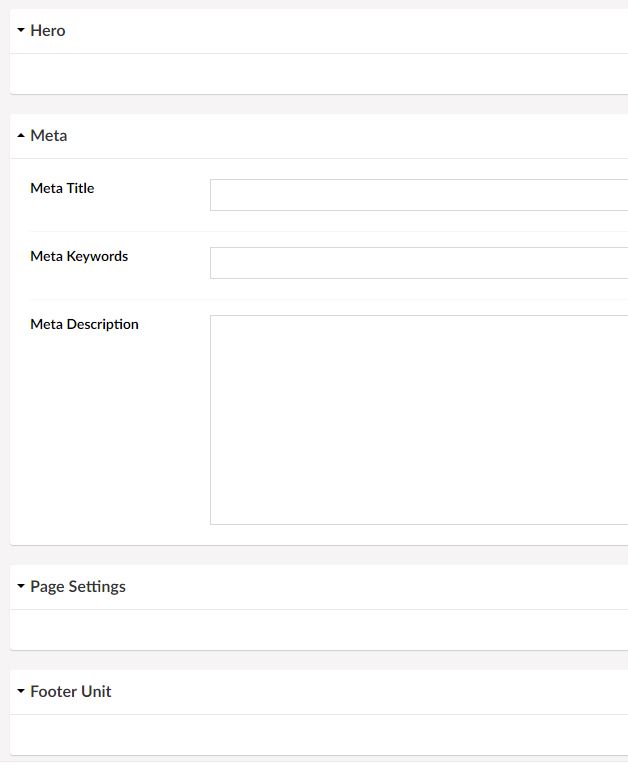
Hi Simon,
Have you put the source on GitHub?
Cheers,
Chris
Hi Chris,
No I haven't, but it's literally a few lines of js & css, so you can download the zip and view the code in there if you're interested.
Cheers
Hi Simon,
No problem, I just thought if it was on GitHub it would make it easy to send you a pull request for a few small tweaks :)
If I get time later in the week I might take a look at it.
Cheers,
Chris
Having just had to manually check tags half way down a tab in 90 articles in a V7.14 site, I was thinking what an absolute nightmare that task would be in V8. It would be slower and take more more effort (brain and mouse manipulation). Not to mention ending up with sea sickness with the slow scroll effect.
I've asked several times what the justification was for their removal but no one has explained why tabs were removed. I don't think I'll be using V8 till they're back. Recent discussions with a client to upgrade their large site had them deciding to stick with V7 for the next couple of years at least.
Hope to have some interesting discussions about this at CodeGarden. Maybe there'll be a surprise announcement ;) We can live in hope, lol
I actually think Accordions are a useful UX for the BackOffice, but only within the context of Tabs. i.e. Within a Tab, add an Accordion, and then on that Accordion add Panels and then add Properties to those Panels. This would allow collapsible sub-sections within Tabs, while not killing the basic category skeuomorphic of Tabs, that people are so familiar with. e.g. I had a Tab called "Sizes" and a long list of properties that I set sizes for... an Accordion would be useful to create sub-categories below "Sizes" to allow faster navigation to the specific properties I want to set. Beside that was another Tab called "Colors" etc etc...
Haven't chimed in here, feeling like I might finally have something to contribute...
One of Umbraco's big selling points is it's configurability and dev friendliness - if we want to do X, we can. If we'd rather do Y, sure, more than likely that's possible too.
Following that thinking, would it not make sense that doctype structure (ie tabs vs accordions vs panels vs whatever other pattern) simply be configurable?
Different content types within the same site might be better suited to one pattern over another.
We could remove all debate around which works best by leaving that decision to the team building the site.
Could not agree more.
Dave
Yes, and this has actually been suggested earlier (by me, as it happens :) as a configurable presentation mode, but yeah... basically being able to configure it the way it works best for you and your dev team (and the admins that need to use it) would be the best approach.
The idea is great but it leaves a big responsibility on the single developer.
Remember that while lots of choices are nice for the experienced, it leads to more initial confusion and higher learning curve for the new.
In my opinion, Umbraco's biggest Achilles heel is the inconsistency of the quality of the implementations - something we experience first hand when we help Umbraco users all over the world.
I love this discussion but still believes that the real solution isn't a conversation about tabs vs accordions vs field groups, but a conversation about why and what features for content models that are needed.
Surely that's more to do with the presentation rather than anything involving a choice responsibility for the dev.
Tabs and Accordions are essentially presentation alternates of the same data structure - label and panel - and so really should be switchable modes. In fact, an admin should be able to flick a mode switch to change between them.
Embedding accordions within tabs (for grouping) is a bit more advanced (although very useful) but a beginner dev is not likely to be taking on that scenario until they've managed the basics.
I strongly support this idea.
Shooting for one experience and hoping that it provides every editor the best possible solution to editing every document type is a fool's errand.
Sensible defaults, with sensible options?
Can definitely see both sides of this and agree that yes, it's probably a larger conversation than choosing a UI pattern.
I'd love a discussion (but should probably be a separate thread) around the different types of data that are needed on a Umbraco install.
When I've seen doctypes with a larger number of tabs, it's usually related to properties that aren't content per se but more configuration. Added as properties on a doctype - likely - because it's convenient for a developer, but not meant as something that an editor should update.
By getting to the bottom of this, we can actually work together on a great solution for all of this, instead of band-aiding various UX "hacks" :-)
100% agree on content vs configuration.
Which raises the question, how should a developer implement page configuration in v8?
I guess the assumed answer is "Content Apps", but that doesn't quite solve the issues around data storage or workflow, (without rolling your own).
Spot on.
I think the correct answer is that there's currently no good way to do it. Let's work on a great way for v8.x.
Short of introducing a whole new data-structure (such as making something like Fluidity first-citizen) then I suspect that large number of Tabs (or Accordion bars) are unavoidable if a Doc-Type needs to have a lot of options than can be configured by an admin, if/when required.
However, from a UX perspective that doesn't mean they have to be unmanageable or confronting to the average content editor.
I'd suggest that this could be managed by being able to assign personality modes to tabs/accordions.
e.g. You're an content editor and your default presentation personality is 'simple' then you don't see the 'advanced' tabs. However, should you need to then you may switch personalities to 'advanced' (or whatever is available to you) to see more tabs/accordion-bars - with perhaps an admin option to lock down personalities based on user-groups.
Somewhere very early in this thread I suggested to have the possiblity to have a tab shown as a "Content App".
That way you can move fields for presentation, configurartion, seo, etc... There so they don't hinder the content editing.
Dave
So let's move on to to the M in CMS 😉
Sure the this is great for the heading+bodyText editors out there. We make solutions for e-commerce managers, they spend all day in Umbraco testing what works. They want flexible solutions that is not defined by the developers first guess. They want hero blocks with 20 settings.
For us this is not about “convenience”
Could you elaborate on how anything prevents you from doing this today?
Hehe.. not preventing anything. But when you have 5+tabs/panels with a lot of fields, the open panels becomes overwhelming for the content editor.. thats all.. Is the answer to this really try not to have so many fields?
Ill start working on some more suggestions instead of just complaining :)
No, it's definitely not. But it boils down to my comment to Lee which is about solving the underlying problem which I'm positive we can and thus will.
The more examples and the more "WHY's" we can get the better (we're also working on processes to make larger changes to the CMS more transparent via meetups, retreats and RFCs).
Would still love to hear the reasoning behind removing tabs in the first place. I've asked but never had an answer. Quite happy to be pointed to a document :)
Placing my vote for bringing back tabs.
Mine too
Me too
FWIW: This would be my basic preferred BackOffice-UX
Hi MB,
I can see this being useful in Tabs that necessarily have a lot of content or as a way to rationalise the number of tabs. Though each time you have to add a title row, space is wasted, in my view.
The excellent thing about the V7 UI though is that:
And then there's the V8 Top menu which wastes vertical space and makes you read it, instead of symbols which humans identify with less effort (we like patterns). But that's another discussion ;)
Actually, it shouldn't take up any more space.
If you want V8 style, it's one tab with it's contained accordion having multiple sections. Because there is only one tab, it doesn't need any UI chrome to be shown or take up space... you just see the Accordion.
If you want V7 style, it's multiple tabs, each with its contained accordion only having one section. Because there is only the one accordion section, it doesn't need any UI chrome to be show or take up space... you just see the Tabs.
If you want a Hybrid... it's multiple tabs and each contained accordion having multiple sections... useful for grouping fields inside tabs.
Now if a choice were possible that would be nirvana ;) If the choice were at install time then maybe it could cut down installed code. Though it could be choice limiting for future site changes. Choices, choices ..... :)
Not sure if I'm making it clear, but what I'm suggesting is that the standard UI should (IMHO) consist of tabs, where each tab always contains an accordion, and then you add your properties to the accordion.
Depending on whether you use a single-tab/multiple-accordion-panels or multiple-tabs/single-accordion-panels, it either looks like V8 or V7... or a hybrid if you use multiple-tabs/multiple-accordion-panels. Add tabs and/or add accordion panels, to suit the UI requirement you have.
Hence, it just becomes a config choice, rather than an install choice, and you can change that as you need, by dragging fields between accordion panels and tabs to change between V8 or V7 look if you need to.
My personal opinion is that accordions just get in the way. As long as an area (tab) is self-contained and is easily navigable without extra eye and mouse movements I'd be happy (I think).
I don't 100% understand this thread but agree that the new way of presenting content editing to the end user is very annoying and confusing for them.
A Homepage that may of contained about 5 tabs in V7 is now an extremely long scrolling page of random property editors.
By the way, are they meant to collapse/expand because mine don't. This is the bit of this thread I don't get, the accordion bit.
Hi David,
The section headers were accordions just before V8 was released. They were quickly removed. I agree with you about the state of the editing surface.
Admittedly, I haven't used v8 since the original release (primarily because of the BackOffice UI) but the original release used a single 'tabbedContentForm' that contained multiple 'umb-expansion-panel's to emulate an accordion UI, and the properties were located on those expansion panels.
V7 used a 'tab-content' wrapper that contained multiple 'umb-tab-pane's to emulate the tabbed UI, and the properties were located on those tab panes.
By moving the V8 tabbedContentForm inside the V7 umb-tab-pane, and continuing to locate the properties on the umb-expansion-panel(s) of the V8 tabbedContentForm, you could them emulate either V7 or V8 mode, by your choice of number of tab-panes vs number of expansion-panels, or even create a hybrid.
If you only have a single tab-pane, it doesn't need a 'Tab' and just becomes a wrapper for the V8 expansion-panel UI. If you only have a single V8 expansion-panel, it doesn't need a header, and is just a wrapper for the properties, and using multiple V7 tab-panes with single-pane V8 expansion panels effective emulates the V7 UI.
Of course, this is all personal opinion, and I realize that I'm laboring the point, but I think the UI could be made to work by stacking the V8 UI inside the V7 UI and appropriate hide states then only using one V7 tab or one V8 panel would allow the choice between V8 or V7 UI modes, and a hybrid option if using multiple Tabs with multiple Panels.
Just started using Umbraco 8 and the removal of the tabs makes it very hard to categorise the page fields and go direct to the content you need to add.
This will slow down content entry and annoy the end users.
Are you aware of the jump nav on the content context menu next to info?
Matt
Hi Matt,
The point is that it's hidden, it's extra mouse movements and eye tracking. When you have finally clicked on the item you had to search for, it then scrolls into view. Once there, it's so easy to over-scroll into an adjacent section (that would have been a self contained area in V7) and then have to hunt around for your place again. It's a poorer, rather than better, interface for the editor in my opinion. It hides stuff, makes them hunt for it and they can get lost. Not what we've come to expect from Umbraco, which is why I'm not selling it till it's fixed as it's too embarrassing.
The infinite editing and variants are wonderful, but this first point of contact is problematic. At CG19 I worked up a compromise solution with Niels (L) on one of the Dream Boards. Maybe I'll put it up on here if I get the chance later.
There were quite a few people acknowledging the issue at CG so hopefully those that are able can do something. I'd be happy to help in other ways, but I don't have the skill level to actually change it myself unfortunately.
I appreciate the hard work that's gone into V8 but the phrase "spoiling the ship for a ha'pth of tar" comes to mind just now. As Niels (H) says, it's not perfect or finished, and to assume good intent, so I just hope this area will get some love before any of the more super-technical, esoteric stuff. Feedback from actual editors would be great if there is any, particularly those running large sites.
It was a comment around it been the solution, I was just making sure he knew about it to improve his quality of life :)
I would be happy to work with Umbraco HQ, Umbraco Partners, and our wonderful community to put together clickable prototypes of editing experiences to find resolution to the issues brought up in this thread.
Happy to do it. I work for a Gold Partner. Happy to connect with someone at HQ to help move this along and do my part in contributing. Someone just needs to reach out.
If you aren't going to work along side (all) partners to address this issue, then please take my advice and create clickable prototypes and bring them to specific partners and specific clients to get feedback. Maybe you do this already. I have never been contacted so I don't know. This process would allow you to test many iterations of ideas without the huge cost of development time.
All the best mates, M
Ok, how about a new idea? (Why not make this thread even longer 😁)
So a common design approach we are starting to see elsewhere in Umbraco which seems to be helping minimise this mass of scrolling is the introduction of a side area.
I wonder if there is any legs in coming up with a way to manage this kind of layout? Allowing you to define properties that can appear in the sidebar? The very nature of just vertically stacking everything is what is really eating up this vertical space.
Maybe we could take this one step further and allow properties to sit side by side within the same content region? ie, rather than having a first name + last name field stacked, why not allow them to sit side by side? (See Lee Kelleher's Tuple editor for example)
Of course this won't fix everything, especially when we are talking about things like the grid and then having more content after it, but it's a different idea to explore beyond just tab alternatives.
I'm not so sure that the issue of properties being vertically stacked on a property zone by default, warrants the complexity of a secondary area for locating property zones. Personally, I find them confusing at times (needing to look in multiple places) and among other things this will make migration from 7 to 8 more painful than necessary - and I even hate the thought of that.
I suspect that the issue of reducing the vertical stack could be addressed by supporting grid layouts in property zones - a basic version of which has been previously implemented in Umbraco-Forms.
I would also still contend that the combination of Tabs and Accordions (Tabs being the primary grouping, and Accordions the secondary) provides the dev with more flexibility in organising properties and only displaying those that are required by the editor for each step in their posting task.
Sidebars are really useful for context information, guides, etc, but moving the property UI to multiple zones... not so much, IMHO. I also think that if you are going to have a sidebar, then it should be off-canvas so that it is only displayed when the editor wants/needs it - and is more compatible with smaller devices.
To that end, I would also suggest some thought be given to the concept of a 'live preview' as an off-canvas display - so editors can see the results as they work - i.e. this is what it will look like if you save it.
Prior to working with Umbraco, I worked with Sitefinity, and while it's no doubt to be expected that a commercial product would offer features that an open-source product lacks, there is a lot there in terms of UI concepts that Umbraco could benefit from evaluating. e.g. Native grid-layout designers and WYSIWYG content editors are intuitive to use, and their implementation of custom data is pretty awesome - think, Fluidity on steriods.
Forgot to mention in my comment about Umbraco-Forms already having partly solved some UX issues, is that it also implements the concept of "conditions" and "logic" that can be applied to properties - e.g. only display property X if the following conditions are met. BackOffice editing is conceptually just forms in a SPA environment, and end-users are already conditioned to expect that level of context response with forms entry. Anyone who has used MS-Dynamics will have seen how far that can be taken.
It'd be great to get a few ideas together in basic form, including the full V7 UI and have as many editors as possible give their opinions. It's editors, both of huge professional sites and simple sites, that this is all about. Enabling them to do their work with as little cognitive effort as possible. V7 was good at that until you got to the tasks that V8's infinite editing now handles. We just need to find that sweet-spot again :)
For what it's worth, here's my vision of what the V8 UI should look like. Basically V7 was very good so no need to break it. It preserves vertical space, puts occasionally used items in the top right (Content Apps, Info, Actions) and maintains the situational overview and simple, contained, content navigation for the editors. Quite happy for the colour scheme to be upgraded, it's the functionality of the UI that is paramount and the only reason I recommend Umbraco to site owners and editors. V7 UI combined with infinite editing is a winner in my view ;)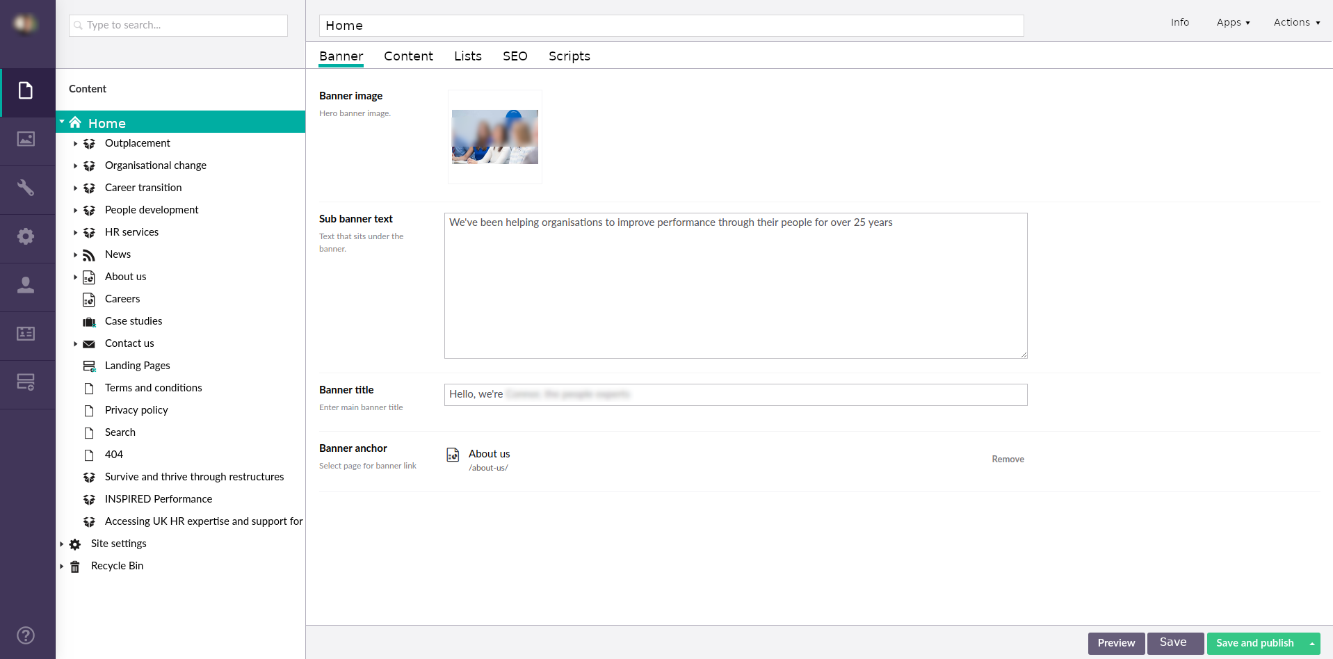
And for what it's worth... here's my vision of what that would look like:
Tabs remain the primary grouping, accordions the secondary, with the property zone supporting grid layout - similar to Umbraco Forms..
A single accordion property zone on a tab requires no bar, and would look the same as yours. A single tab would require no tab UI, and could look like the original V8 layout. Combining the two allows for logical grouping of fields on tabs (as shown here).
Extended help/guide/wizards could be provided via off-canvas panels that can be triggered by definable actions and/or field-types - e.g. (?)
Conditions can be applied to fields, to support logic such as show/hide on condition, creating wizards, etc.
In case anyone is looking for a "temporary solution" to the tabs in V8, have a look at this package by Sebastian from HQ:
https://our.umbraco.com/packages/backoffice-extensions/cultiv-tabify-umbraco-8/
Just tried the https://our.umbraco.com/packages/backoffice-extensions/cultiv-tabify-umbraco-8/ package. It seems to fix my "major" concern with V8's UI. So many thanks to Sebastiaan for that. It could now be useable.
The next issue of course is the fact that the menu (now without icons) is stuck to the top reducing the available work space. Not ideal for modern 16:9 monitors, but that's probably another thread ;)
Yes, thanks to Sebastiaan.
This plugin is a lot better than not having tabs at all, but unfortunately has some limitations that I assume are imposed by the virtue of being a plugin. Not least of which is that the tabs reside inside the scrolling 'content' region and so disappear as you scroll. This as opposed to the native tabs of V7 which reside outside the scrolling region and so are always accessible to the user.
I've never tried to target the area outside the content region using a plugin - I guess that it could be done with some jiggery-pokery, but would probably be quite hacky... I might need to experiment with it, but I suspect it could get ugly.
If you want sticky tabs, use the umb-sticky-bar directive. Might take a bit of fiddling, but this would be a good use case.
There's no limitation around what a plugin/package can do, based on where it is located. Just have a poke around the available scope , or grab it off a nearby element...
That sounds like a plan - I might play with it in my 'spare' time (ha!) and see if I can shape it to suit my needs, as otherwise it's a really good starting point.
Late to this post and late to this package... but just wanted to add another voice to how good this package is and I feel like it's a step closer to what we need from a content-heavy CMS.
I had secretly hoped that the tabs would return in 8.1 but unfortunately there were (at first glance) no improvements made to the UX. I therefore wait a little while to upgrade.
same :-(
I am late on this I know but we have left Umbraco 8 till now so it can get things more stable and 8.1 we went to build sites on this again.
Tabs was a big thing for using Umbraco for sites with heavy content. Compared to many systems like Business Catalyst with just block after block with some toggle options, Kentico with toggle options and just big pages of scroll content. Kentico for example it is one of the bigger complaints in terms of both presenting and managing content, it has tabs and one of the bigger requests was to be able to push content into tabs to break them up.
Umbraco going a bit backwards in this has been a bit of an eye opener. Firstly - I totally get the change in terms of the endless content editing concept and that goes a long way But you wont have document types that are extensive always called in these, it will be the section blogs or smaller elements that you load up in the panels and for the most part you do not want A LOT of fields and groups in there because there would be a massive scroll.
So for the most part you wont have the need for groups in those endless editing panels to the side anyway.
In the image above you can see an example. For your main "Home" Document type having content for it but having tabs for the core site navigation, footer and in the image the core SEO fields or 3rd party is key to keep it all clean and they are all different things. It would not make sense in this case to be just group after group.
You should have the option here. Groups as they are now need a few options which people have covered.
The whole document type itself then needs an option so you can say if it is available in side panel feature. If it is then it loads as such but if not then if a link is clicked it just loads the document type editing in a new page.
If the document type has groups which are tabs then it CAN NOT be in the side panels.
I think we will all be fine with that and being given the choice although very simple ones will cover the basis.
Being able to have GROUPS & TABS on the single document type and these options will be very cool.
Are there any current plans in the roadmap to improve the usability of the current content properties?
Our clients aren't fond of the missing tabs and we agree that the current v8 management is a worse UI than the v7 tabs. Before we go ahead and add in the Cultiv Tabify package or another solution, we wanted to see what the future plan was, if any.
Although i am a developer, rather than a project manager or content editor (where i work we have both), when i am building an Umbraco website I actually prefer to use all the real content if it is available, as it shows up any shortfalls in the design at an early stage. Consequently i use the cms as an editor quite a lot, and i gotta say that removing the tabs is a bad move.
"Show'n'hide css/javascript tabs" were invented specifically to remove the irritation of long scrolling pages all those years ago, and long scrolling pages are still irritating now, in 2019.
@Marshall Penn, humans are humans with a very long evolutionary process ;) I do a lot of content editing too which is why I think it imperative that tabs or some other in-view navigation device is brought back that containerises the content sections (just like tabs do in V7 ;) ).
Have just tested the latest changes to the Tabify package and I reckon it's now fit for production use. But would much rather the idea was put back into core. It kind of shakes your confidence a bit, knowing someone thought it was ok to remove them.
//Craig
We've just built a major client's website in Umbraco 8.4 and not having tabs, alone, is enough for them to pose the question of rebuilding the entire site.
It's that bad. And I agreed with them.
Thankfully, we'll use the Tabify package thanks to this thread.
But I guarantee you we'll be sticking to Umbraco 7.4 henceforth. Not a single client has complained about tabs on that version. Ever.
Couldn't agree more with Craig.
Hey RyanW,
Checkout https://our.umbraco.com/packages/backoffice-extensions/matryoshka/, it's Tabify on steroids. Which is lucky as Tabify has been retired. Let's hope it gets put into core as soon as someone's worked out how to integrate tabs into variations (or vice versa), which I reckon was the reason it was left out hoping no one would notice.
Incidentally, why 7.4? 7.15.x is/was a great UI. Would have benefited from infinite editing but that's not a show stopper.
Comment author was deleted
Yup will be a must install package for most builds (where you have a decent amount of groups/tabs on doctypes). Anyone know the reasoning for removing tabs in the first place? Long thread to read through :p but it shows it's a delicate decision to make... btw just noticed that in the API the groups are still called tabs
I do alot of content editing and I was astonished at the decision to lose tabs, very poor one in my view. The sheer amount of 'content' now on a 'page' since tabs have been lost is insane. It's messy, stuff gets lost, in short a complete car crash of an idea compared to tabs.
Tabs nicely broke to page, the content and gave a sensible flow of the page from left to right. I do despair with whoever decided to remove them :-(
I'm glad that https://our.umbraco.com/packages/backoffice-extensions/matryoshka/ exists, I'll be asking our dev team to look at this.
I can see now reason why we can't have the current situation along with tabs.
V7 tabs was heavily reliant on AngularJS for its implementation, which has no long-term future in Umbraco - or anything else for that matter. Perhaps that influenced the decision to leave it out of the core UI.
Possibly, that's a good point.
I'd like to think that decisions would, or should have been taken based on the best content editing experience though. This is something that Umbraco prides itself on, and something I've sold it's values on. So if tabs was useful, which I'd argue it was, then it should have been rebuilt in something that is supported ongoing.
From my knowledge, it was due to the side by side editing experience. Tabs been angularjs dependent doesn't matter they could be done with just JS.
Matt
Comment author was deleted
Yeah the backend is a single page app in Angularjs (v8 also) so don't think the dependency on the framework had any impact on the decision...
Side by side editing? Could you eleborate? Since if the data is structured in tabs it's easier to do side by side editing? Instead of having to scroll to the correct point twice...
When doing languages side by side. I believe it was mentioned that tabs didn't work well (it's been a while and I can't recall the source)
Comment author was deleted
Ok thanks for the intell, do you also know how to enable side by side language editing? Don't seem to find the option in latest v8
this is how it is supposed to look (found in blogpost on umbraco.com)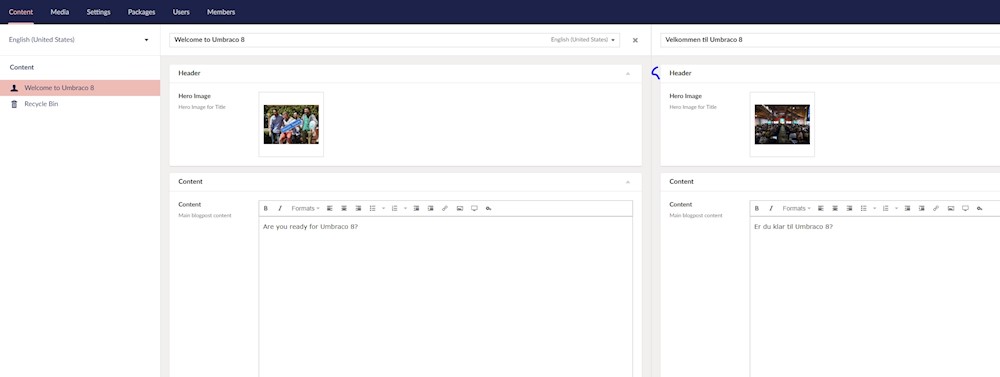
Comment author was deleted
ok found it with help of Matthew Wise, when you have languages available and you can vary by culture on the doctype, the docs will have an option to switch language on the right op the name, and there is also an option to open in split view....
Comment author was deleted
and I have the tabs package installed, works fine with side by side editing...
But does switching tabs in one panel, switch in the other?
Hi Matt, they are not in sync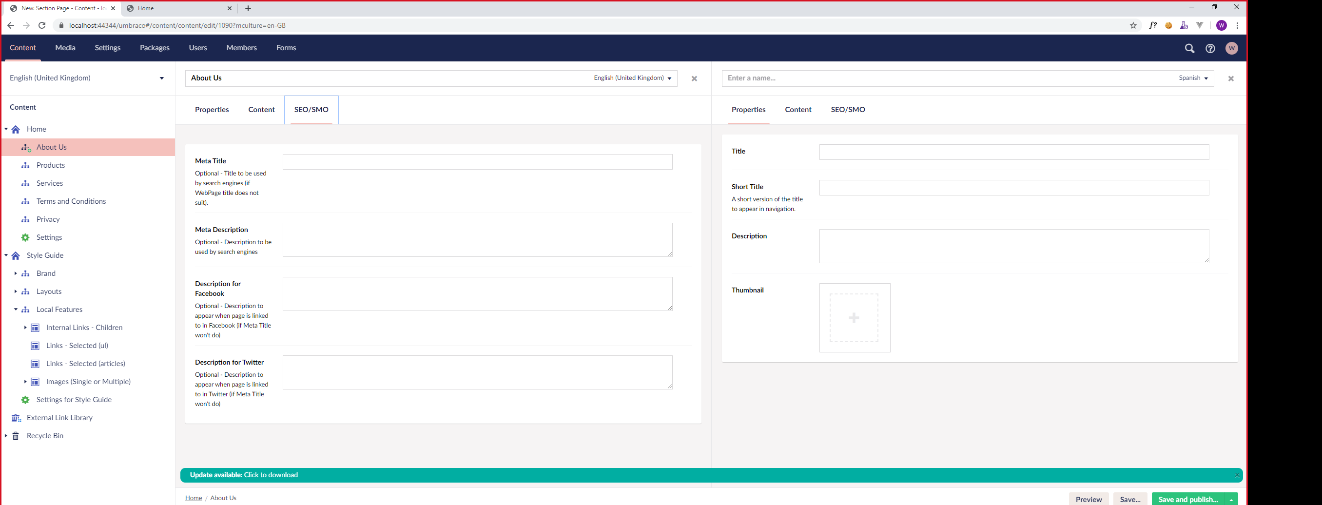
Do they need to be? I would prefer not.
What's your reasoning behind not wanting them in sync. I would have thought it would help to prevent errors, less clicks required, etc. Just curious.
Im not to fond of automatic events away from where I actually click. The effort of making them in sync isn't that hard.
The point of the side by side is to facilitate translation so you are likely going to want to sync between the panels.
Either way, I think this likely proves the point why HQ did away with tabs. No tabs, no argument whether to sync or not sync. And no building extra UI to toggle the sync or not sync for those who don't want to sync. And no client forgetting to toggle the sync button to sync the tabs when they forget. 😁
For the record, I want tabs back, I'm just saying, removal of tabs simplifies the translation/variants implementation and boy is variants a complicated beast, so one less thing to worry about, it one less thing to worry about. Maybe now the variants work is mostly implemented, maybe re-looking at tabs could come back on the todo list.
I think the wholesale removal of tabs just to stop an argument in this particular case is a bit draconian. Besides, look at the length of this discussion, lol. It really isn't a minor point. The M in CMS is for Management. Removal of in-view, containerised content navigation (formerly known as "tabs") has made the Management task harder. Unnecessarily in my view. All the additional goodies that V8 brings my not compensate for that on a massive site.
Sorry Matt, I was typing this out while you were editing your last post, lol. I pretty much agree with you :)
I have worked on numerous multi-language sites (14+ Languages e.g. Animal Planet, Intel) where there are chunks of content, features and functionality that differ in the sites mixed in with a lot of common content. Therefore syncing would make it impossible for editors dealing with cultural differences.
I agree - and also agree making them sync if required could be easily added as a different editor type.
See my answer to Matt - but basically language sites are more than simple translation and are often very different
Hi Dean, and in those cases are you using multi-tenant solutions as opposed to Vorto-style single-site solutions or not?
Sorry Craig my whilst those terms sound familiar I am have not been using Umbraco long enough to understand what you mean.
Comment author was deleted
nope but I guess could be an option in the tabs package
Hi Dean,
Sorry, a bit late seeing your post. "Multi-tenant" is where you have a single Umbraco back-end managing several web sites (Home nodes with different hostnames &/or cultures). Vorto is Matt's package for in-page, side-by-side translation for V7 sites (https://our.umbraco.com/packages/backoffice-extensions/vorto/).
HTH
OK I thought that may be the case but didn't want to make assumptions. The large projects I worked on in the past (Not Umbraco) often began as multi tenanted but very quickly became separate website applications for some of the reasons I quoted earlier.
I understand. But one thing to consider is that while it's no effort to sync by hand once, doing it 100+ times a day would be onerous. Part of the design process is to reduce the cognitive and physical load on the editor. But it's a balance. Maybe a "sync" control?
Just have sync-able content editors
Comment author was deleted
Tried to get a response from HQ about why they removed tabs...
But after a month of asking the question still no reply here...
On the other hand the v8 package (that brings back tabs) https://our.umbraco.com/packages/backoffice-extensions/matryoshka/
Is now also available on nuget
Install-Package Our.Umbraco.Matryoshka
I would be very interested in the decision making process and that lead to tabs being removed.
Now I have some time on my hands (can't think why ;) ) I can share some points I found interesting when watching the Umbraco Festival Deutschland 2018 Keynote which, if anyone wants to see it, is here: https://www.youtube.com/watch?v=uzaNd-9KUbA
I didn't see this till after V8 was launched.
This isn't a critique on the presentation nor on the tabs issue per se. It's really to highlight the apparent disconnect between the care and attention lavished on the editing experience and then the almost off-hand dismissal of what I think of as a vital element of that experience.
03:38 - "Humble CMS provider"
05:00 - 06:25 "Friendly, simple, social" - "Making sure Umbraco doesn't get in the way" - "nice product to use"
24:55 - 25:31 - "Really bad at understanding what users want"
1:00:50 - "Too bad, we don't have tabs anymore".
When I saw early demos of V8 I just assumed that it was a work in progress and tabs would be put back in before it was released. Even having had face to face discussions with people I still don't know the rationale behind their removal but I also get that they get why they should probably go back in.
I guess we'll just have to "watch this space" for now :)
Comment author was deleted
thanks for the link, will have a watch next week... but yeah I agree the reasoning behind it would be great to know... know it feels like we need a place to put content apps... lets remove tabs...
We are a design agency based in Auckland and have built 100+ complex Umbraco sites over the last 10 years. Most are now on Umbraco 7 but we have just started with Umbraco 8 having let it settle down and become a bit more stable.
Although we really like tabs in U7 we started with the goal of keeping to core (we don't like relying on packages if we can help it) so we built the first site and content loaded without tabs. At the same time we have been developing a few more sites and for one we installed the tabs plugin - https://our.umbraco.com/packages/backoffice-extensions/matryoshka/
The difference really is light and day for us I'm afraid and for a number of reasons.
1) You can't see at a glance what section you need to go to without scrolling or clicking the Content drop-down.
2) Navigating sections and properties without tabs is hard - they just all blur into one as you scroll.
3) We build complex solutions rather than "brochure" sites meaning some of the more detailed doctypes could have 40-50 fields on them. This, displayed in one long page is not fun. I can imagine a doctype with 5-10 fields being fine without tabs but that's just not the case in our solutions.
4) Without tabs, training our client editors also felt more clunky, it was always easier explaining how the page content is made up when you can click between tabs.
5) When we migrate client sites from 7 to 8 we are going to get a lot of pushback if we don't give them tabs. We have clients with up to 50 editors that are all used to working in a certain way and won't appreciate the change.
In my experience, with my team and with clients it's clear, tabs are a better UX.
However, even if you think they're not I don't understand why Umbraco think they are so bad or are so against having them. The package I mentioned seems to work really well and fits nicely with the new layout, content apps etc. It's now part of our "core" product.
I would be interested to hear the views of developers and agencies who also build complex applications in Umbraco and how tabs / no tabs work for them.
Thanks for reading :)
Hi Paul
Same experience and same solution here - matryoshka to the rescue.
Still, I find a need to go further. Having 50 properties on a doctype typically means that a lot of them aren't used always and that its now up to good description writing to convey how to use the doctype in different circumstances.
To get around that there's always building your on property editors which you probably already do too.
In addition, we use nested content. We move most that are not used every time to nested content elements. Nested content is the configured with different nested elements "configurations" such as "Add redirect", "Mailchimp config", "Filter on tabs" etc.
Makes it clean.
Comment author was deleted
yup same here, might work fine on a starter kit with a couple of properties and a single backend editor but once you get into real world scenarios... still no response from HQ after a request on twitter now 3 months ago...
Hi Jesper, glad to hear we're not the only ones with this issue.
We too love Nested Content having used it extensively before it got into the core so that was a great example of a package that has become indispensable.
Some DocTypes are very specific to the type of page we want to create and while Nested Content is a big help, sometimes I like just having the properties on the tab because they're not repeated sets. This means less clicks for the editor to see what they can enter/edit without expanding or having to choose what type of nested content they should use. E.g. for detailed product templates or accommodation templates. I know one nested content item auto expands which is good but can look a bit weird then.
Anyway, hopefully Umbraco will understand at some point the complex apps some of us build with their excellent product.
Cheers, Paul
Great post Paul, sorry "Our" won't let me H5YR it (didn't know 5 was a limit!).
Your bitter experience has reinforced what was pointed out from just looking at it way back in Jan 2019. So for Tim saying HQ haven't replied in 3 months, they haven't commented to reassure us in 18 months either. As they haven't detailed their reasoning, we're not given the opportunity to understand what the issue is that HQ have with fixing this particular UX regression. It would be really interesting to know. While Matryoshka has probably taken the urgency out of it for them, it's such a basic requirement in many people's view, it concerns me they don't see it as important. The CMS IS the UX/UI afterall, otherwise why bother? However, my fingers remain crossed ;)
/ Craig
My concern is, with the launch of their new product that they are continuing to move away from a product building up the product but dumbing it down. Targeting no code click building market seems like it is a big market but has killed products and companies who have tried to go down that road.
Adobe's Business Catalyst product was full of potential, growing rapidly for what it had for it's price and after the "transition" period Adobe had a lot of talk and some early updates that were positive. Internally they then decided to target the low end, designers, small sites and so on and dumbed down the product leaving partners and majority of it's clients angry and frustrated over years. Launching Muse and so on.
A number of key partners tried with them, told them what would happen and tried to help the platform grow but Adobe did not really listen.
They had an influx in small sites and designers trying to make sites or creating them. What followed was an influx of support. While you can make something build something that looks like a site, even with a SAAS platform the issue comes with things like needing a domain or setting it up, clients needing email or email support. From there clients then want more features to their site and while the platform may do that, the click drag and draw people do not have the skills like developers to do that. The Adobe platform had no server code and templating and used Liquid Markup (Shopify) to build out but had a lot of features but never really worked on as you would expect.
The support load was too much and the small site market does not last, sites do not stay on. Clients cant get features they want so they move elsewhere to platforms and agencies that can do that. Short lived stuff.
As a result it failed and the BC product is now EOL!
Seen it before, a number of people called it and a big company like Adobe did not listen. I just hope the Umbraco team is not creating the same mistakes.
For me they should be continuing the path they have. There are BIG .NET platforms in a real mess right now. Some not even MVC, trying to make a good MVC and moving to .NET Core and falling over themselves.
The market is really ripe for a good CMS that is easy to get into but can expand with you as you learn it/coding etc. You can build basic sites but you can very smoothly build them to be more.
FORMS is a great product because it's there and you can pay a bit extra. Umbraco being free is awesome but giving some back through getting clients to pay for things like this is a no brainer. Umbraco should continue this trend...
A CRM. Expanded members, something that forms can post to members entries, log some more activities and some nice API so marketing stuff like Mailchimp can tap in/post back too etc. Another paid addon.
A solid paid ecommerce addon. There are some new ones I have not tried by the community but there have been others in the past like Merchello. Talk big and still advertise as something you can buy but buggy with no support and out dated now. This is a hard and big one but a Umbraco based addon, for a decent price that can hook into forms, CRM addons would be something that would take longer but again add to the Umbraco Arsenal.
For me, that is the kind of direction, keep pushing the core forward, .NET Core, new features, solid updates, continued back office improvements but then offer solid additions at a price to the platform so you can choose to extend it with the knowledge of support of the solid core team aided by the community.
Sorry all, I just reading comments here and seeing some of the announcements and just getting a little concerned.
Hi Liam,
Did you mean to post in the Tabs discussion? It looks like your post is about Uno.
/ Craig
I can't echo the comments from Paul above enough... same boat here as well.
Comment author was deleted
And still nothing from HQ... I did have a chat with a partner manager for a client (gold partner) and brought up the tabs thing...
But the HQ side didn't make much sense:
1) We did user tests 2) Needs fewer clicks
When I asked if it was possible to see the user tests, the manager said he didn't have access.. when I asked if he could get access, the manager said he would try, when I asked if he could ask the same day he said he won't be able to get them ...so all in all I got the feeling there wheren't any tests...(comparing tabs to groups)
So he ended up with saying the main argument was: less clicks.
Brought up the example of docs with grid + some nested content + some seo stuff, which has the editor scrolling a lot to find the correct bit of data to edit... (not really a reply)
So yes it seems Matryoshka is the way forward, to bad it can break on core updates...
Comment author was deleted
still nothing from HQ :(
I just installed my first v8 instance along with a uSkinned theme and the scrolling is insane, I've been using Umbraco daily for over 10 years and was totally overwhelmed.
It's https://our.umbraco.com/packages/backoffice-extensions/matryoshka/ I'm afraid. Needed now for every site to prevent HQ from hiding the content subnav from you and driving your editors mental :( Sad indeed. Umbraco is supposed to be the editor's friend.
Hi Amir,
Marc from uSkinned here. We too are definitely behind the "Tabs" option returning to core. We have built our V8 themes without using the third party plugins that provide the tab feature as we believe it is important to follow the way Umbraco want this to work. Fingers crossed tabs return at some point. To help reduce some of the scrolling we have introduced conditional fields to hide some properties depending on your selections however we agree, there is still a lot of scrolling which is unavoidable unfortunately.
Cheers,
Marc
Yep, nothing related to uSkinned specifically, the template looks great.
If you're watching umbraCoffee last Friday (https://youtu.be/U6usugN8raM?t=48), Niels kindly compared XPS 'nose cam' to Umbraco tabs and said that Dell finally moved it back to normal - so it's definitely on HQ's radar.
Hope it'll be configurable as I see use cases for both and I also experienced broken instance recently after the upgrade of the Core with Matryoshka ;(
Let's hope you're right Marcin.
Will have to take a look at last week's umbraCoffee, thanks for the link. I have an XPS with the nose cam (never heard it called that before but that's exactly what it is). Good that Dell are sorting it out but it just goes to show how such obviously daft ideas slip through. Can you imagine the amount of money Dell must spend on their top of the range laptop design. They could try quietening the fans down too while they're at it ;)
That's an hilarious analogy and honestly, we all move in a less than perfect direction sometimes.
Comment author was deleted
so because Niels made a joke on umbraCoffee it's on the radar? Let's hope so... the proof is in the pudding
What broke?
I said before, but as a designer and developer I can see that tabs created an issue regarding their move to the slide out edit everything concept in 8.
Matryoshka Package is close if less refined in some places but shows that with work it could have all been sorted. TBH, as they have with much of Umbraco in the past they should talk to Søren and get the package into core Umbraco with some further tweaks and improvements and it will be all good.
Thank you everyone for your continuous passion around this topic. From the HQ side, we haven't responded as no new points in the discussion has been brought up that hasn't previously been answered in the thread.
While it's easy to get the impression from this thread that Umbraco 8 is useless without tabs, there's hundreds of projects being done every single day without tabs.
That doesn't mean we don't listen to the people in this thread, who've expressed a need for a tab solution.
We've enjoyed how first Sebastiaan (as an individual in his spare time) came up with a solution which several members then constructively contributed to and eventually became the great Matryoshka package.
We believe that the package is a brilliant way to add tabs for those who have the need.
That's why using the Matryoshka package is our official recommendation for those who wants tabs in Umbraco 8. It also means we'll add the Matryoshka package as a part of our test suite for new releases, ensuring continuous support in future versions of both patch and minor versions of Umbraco 8.
Hope this helps!
All the best,
Niels...
Comment author was deleted
great, knowing that we can safely upgrade a solution without breaking the backend is ace (so yay for adding this to the build/test process)!
While there may be hundreds of projects without tabs:
This is the general vibe I get from the discord groups and forums I am in.
You should just work to have that package as default. I remember early the reasons for dropping tags and the first person who had a go at tabs that this came from showed it was not the case.
I think that's a fair compromise :)
Thanks Niels :)
For anyone that has not used Matryoshka. It is more then just tabs. It introduce a property to create group seperators and the tabs can have drop down to the sections you make. Those groups can have open and close default options as well.
It is very good, it has a few bugs still that hopefully be continued to update as it is still only 0.4.0. That is why either Umbraco team gives Soren full support for it or they integrate it.
No bugs according to https://github.com/skttl/umbraco-matryoshka/issues
Feel free to report some :)
It's pretty solid for sure and I should, I know! Lead dev - Very busy with short staff due to these crazy times as well. I will make sure I make notes and get them in for you!
Comment author was deleted
At last, tabs is making it's way back to v8 (core) https://github.com/umbraco/Umbraco-CMS/issues/9442
My issue is that if on first load of a content node you only see the first open accordion you dont get a quick over view of all the tabs you are going to be working with, i.e SEO, Settings, Content etc.
Just to add my voice. Umbraco developer for 10 years.
Definitely need tabs 100%. Our doctypes are long, and make for endless scrolling for our content editors. It's just untidy without them.
Also I've never created a multilingual sites where the content simply needs translating. Each country market always has exceptions and different content, which makes direct translations unfeasible. Which from scanning the forum is the reason why tabs were removed to make editing easier.
Shall install this package and hope to see a config setting in the future :)
Hi Tim,
You might like to look at the latest situation. The conversation about putting tabs back has moved to here: https://github.com/umbraco/Umbraco-CMS/discussions/10488
HTH,
Craig
Att: Matryoshka users - I've put up some polls to get an idea of which features a being used in Matryoshka, if you can, please answer: https://twitter.com/skttl/status/1412678362376589315
is working on a reply...
This forum is in read-only mode while we transition to the new forum.
You can continue this topic on the new forum by tapping the "Continue discussion" link below.